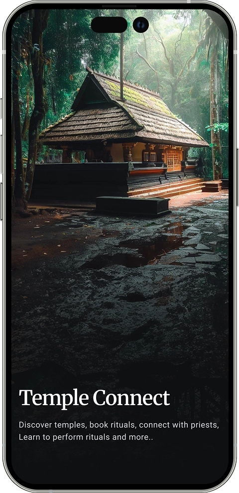
UX Case Study

I Helped People Practice Their Faith, Right From Their Phone.

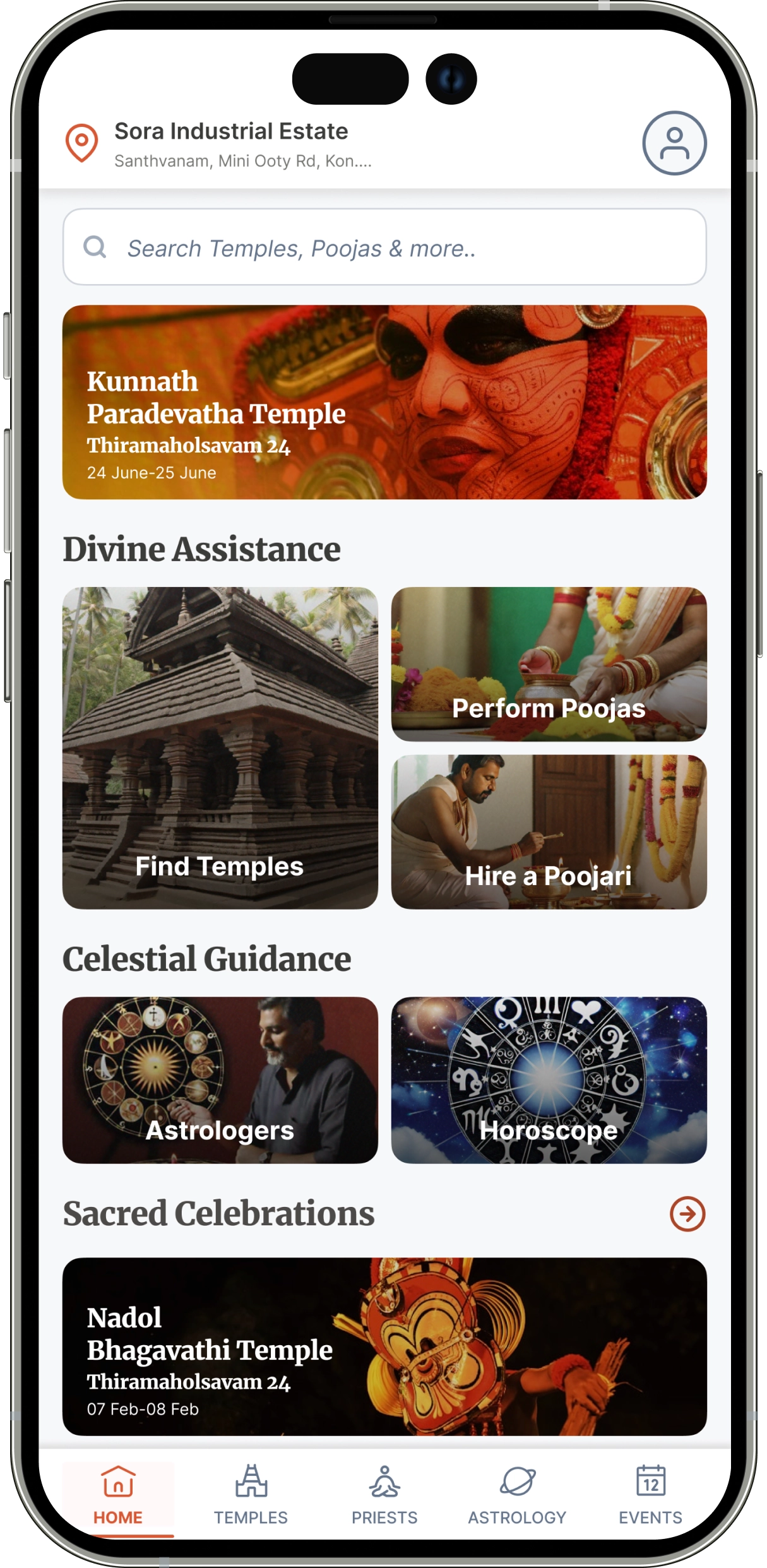
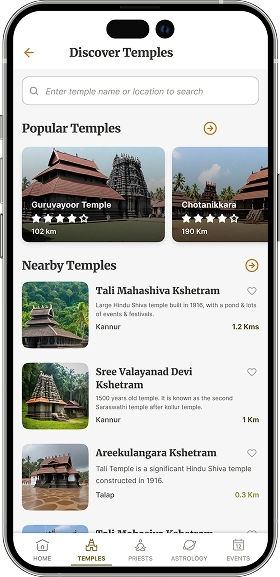
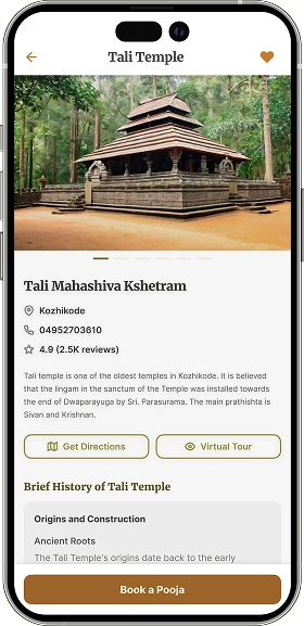
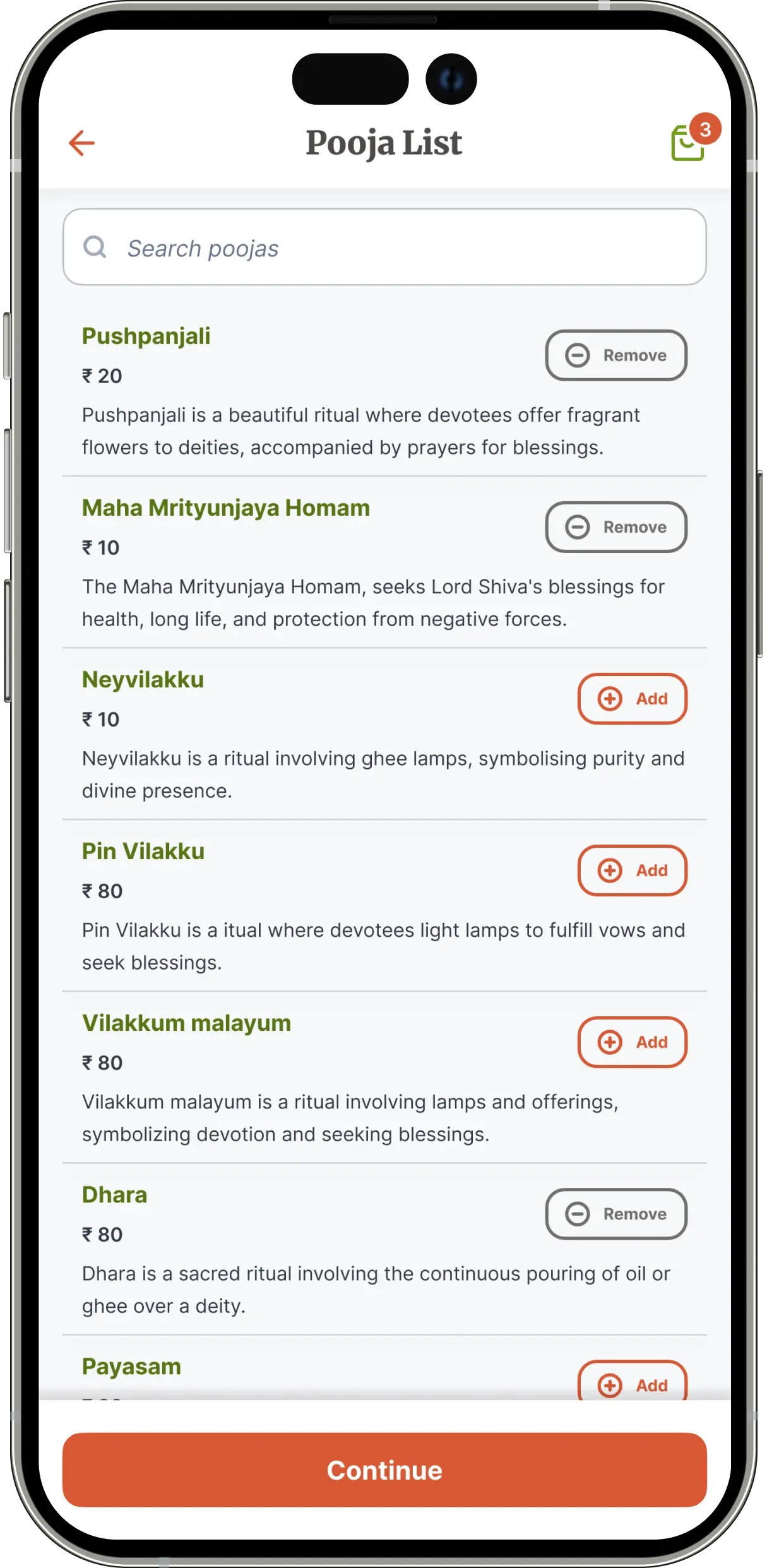
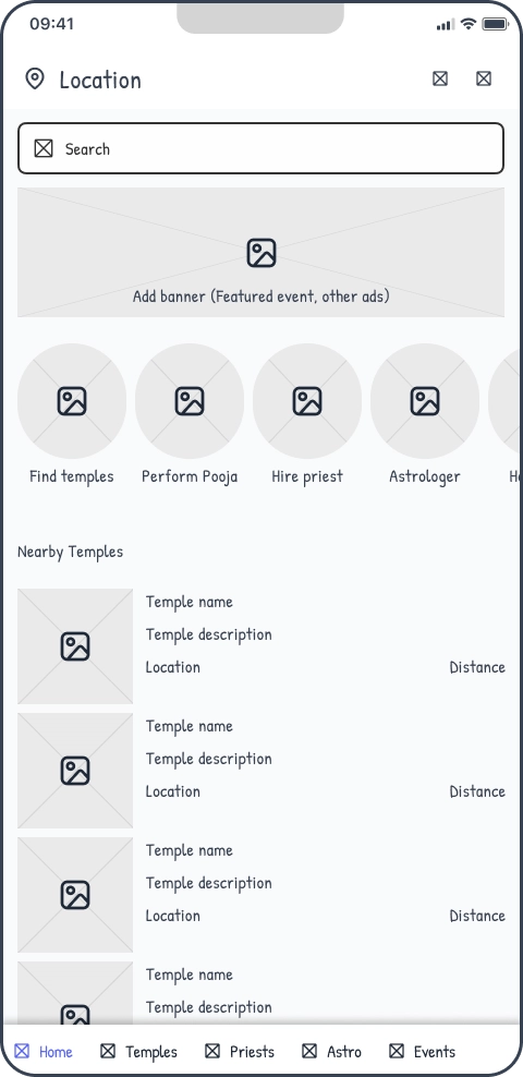
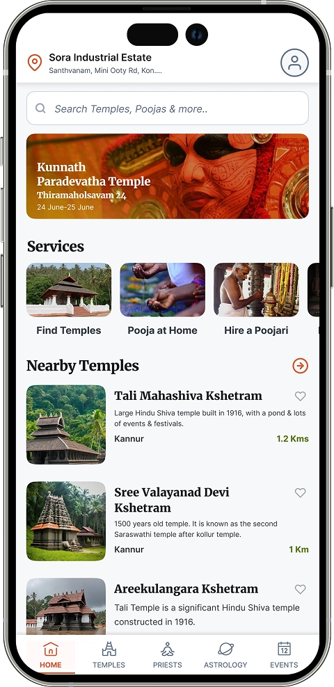
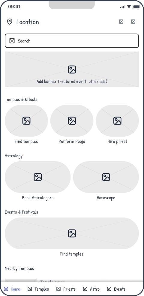
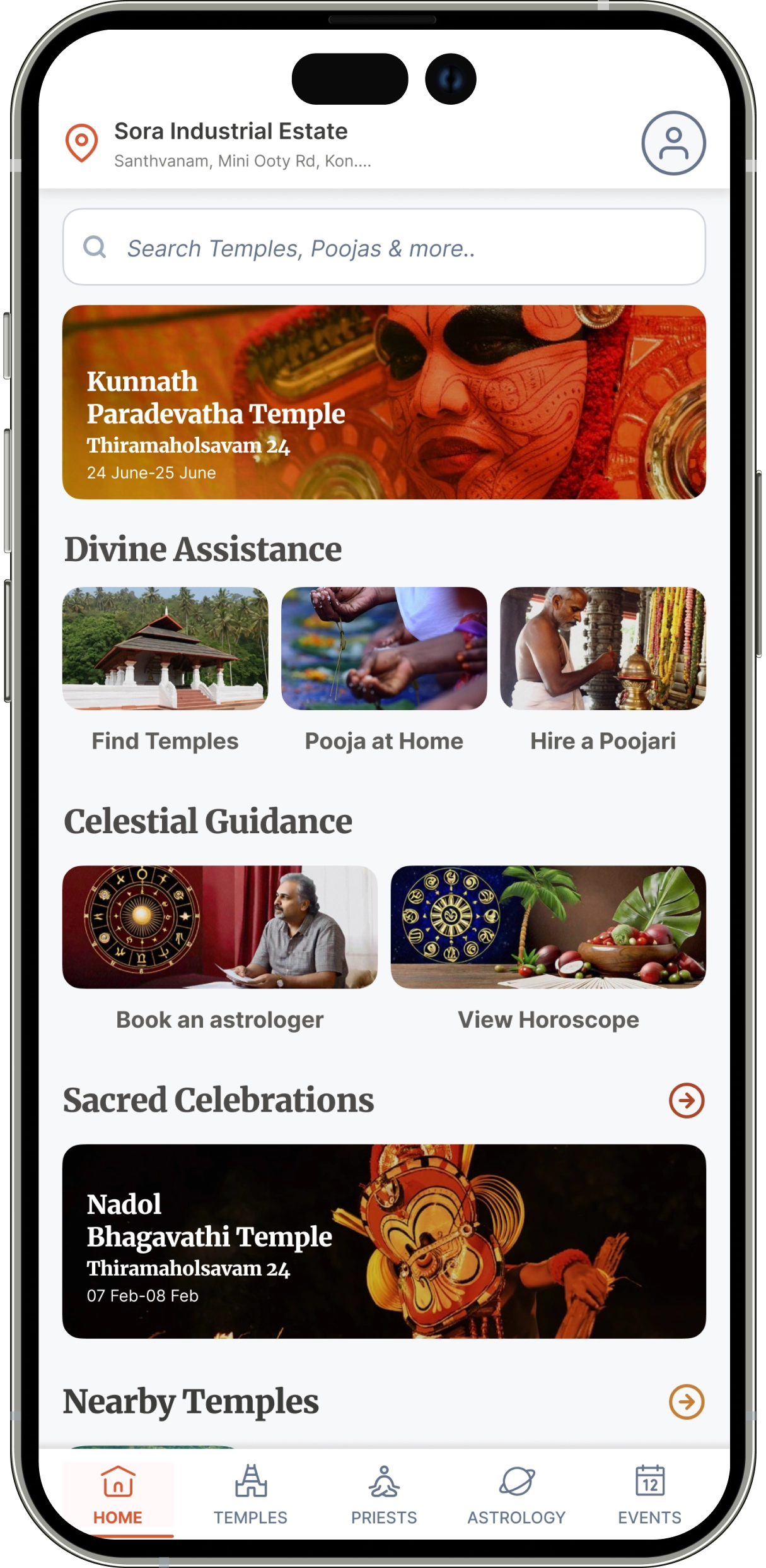
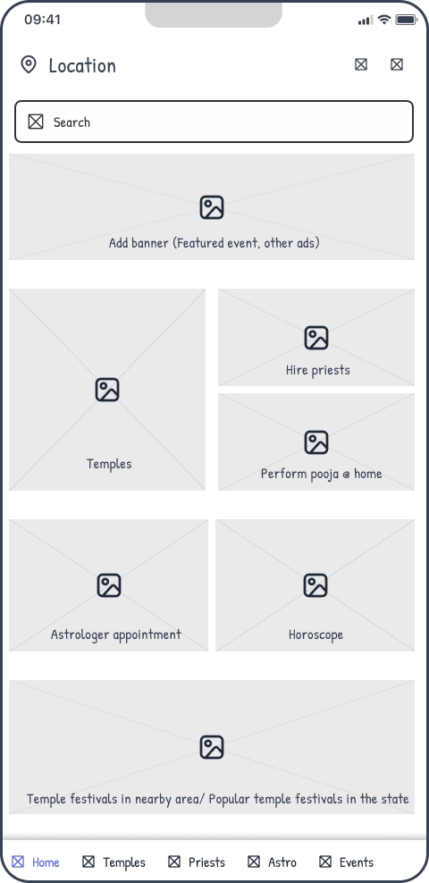
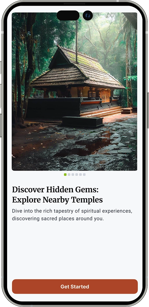
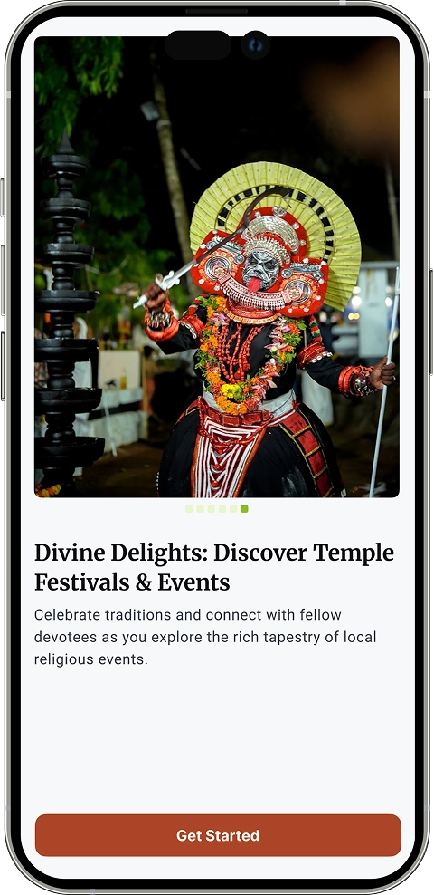
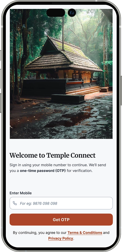
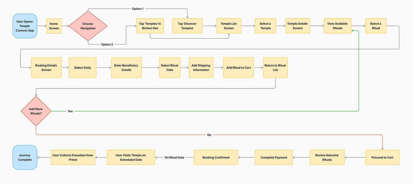
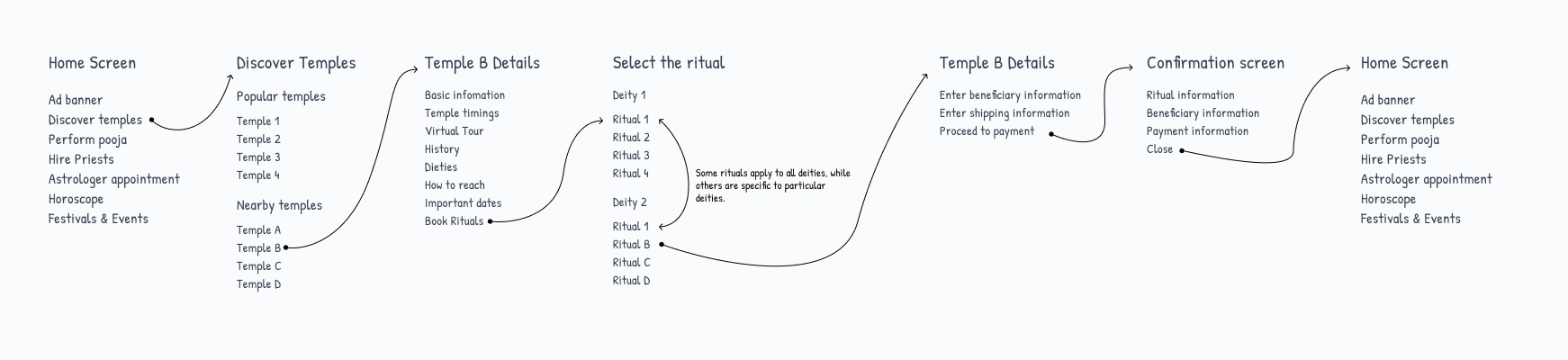
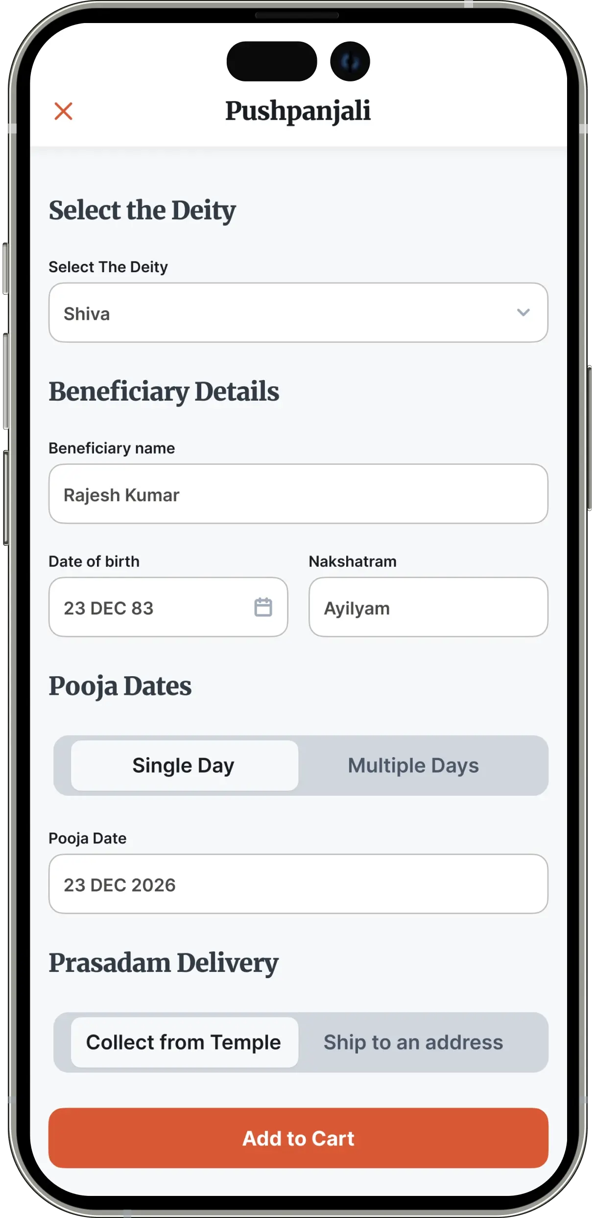
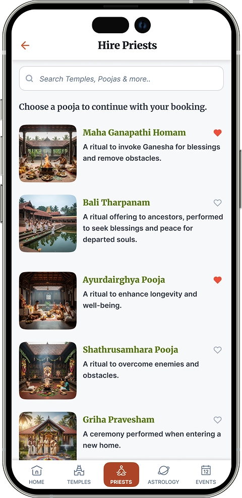
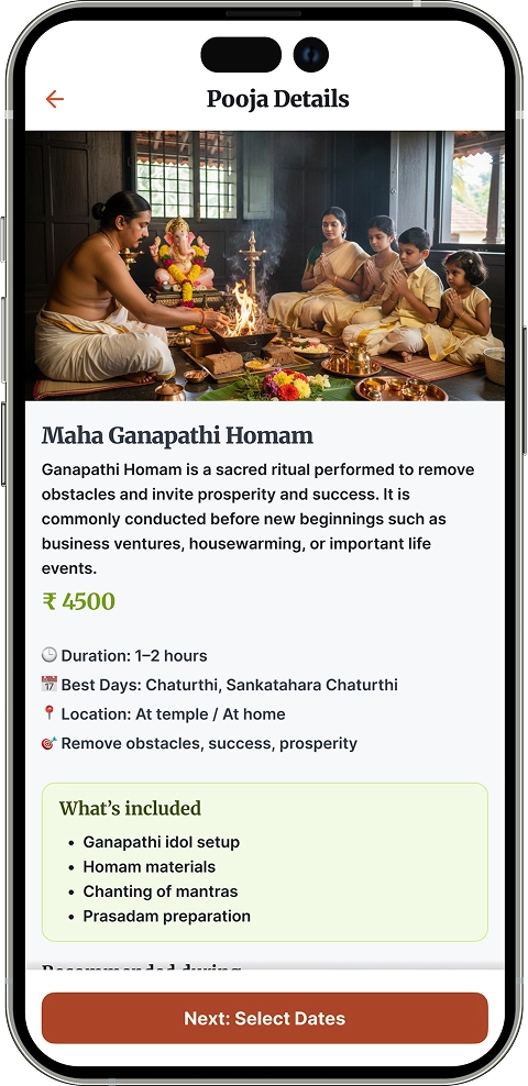
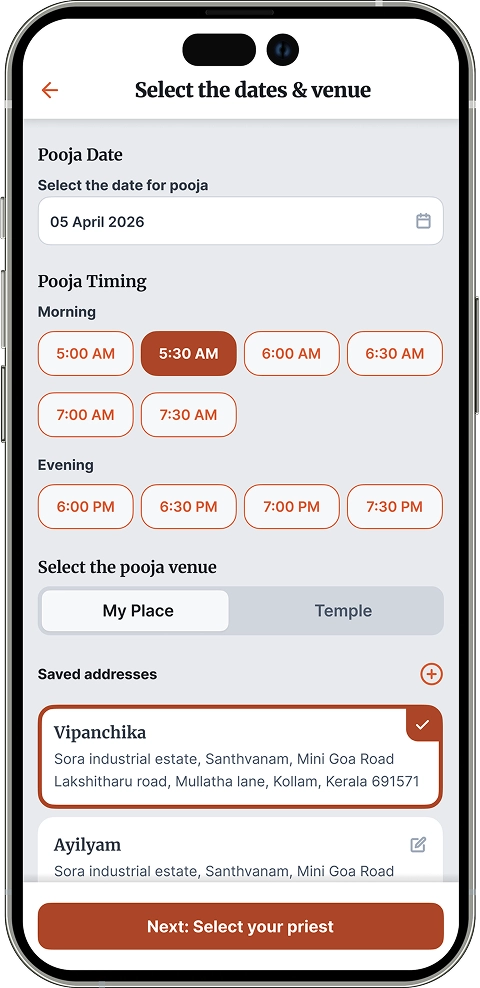
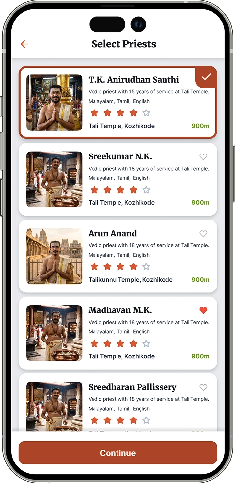
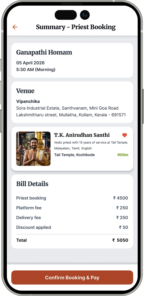
Temple Connect is a mobile product that makes temple discovery, priest booking, and guided rituals accessible to anyone, anywhere. This is how I designed a digital experience for something that was never meant to be digital.

Mobile app screens of Temple Connect showcasing temple discovery, step-by-step ritual learning, and spiritual services
Discover temple screen design for temple connect app
Temple details screen displaying temple information, history, and booking option
Rituals list screen showing available pooja services for a temple

Introduction

Temple Connect Mobile

Temple Connect is a mobile application designed to help Malayalees stay connected to their religious practices, regardless of location.

It enables users to discover nearby temples, learn how to perform rituals at home, and access temple-related services in a simple and trustworthy way.

Goals

  1. Enable users to discover nearby and lesser-known temples.
  2. Provide simple, step-by-step guidance for performing rituals at home.
  3. Create a trustworthy platform to book priests and services.
  4. Help NRKs stay connected to cultural and religious practices.
  5. Make the app accessible and easy to use for elderly users.
  6. Build a scalable platform for future services like astrology.
  • Role
    Product Designer (End-to-end)
  • Responsibilities
    UX Research, Product Strategy, UI Design, Prototyping
  • Timeline
    6 Weeks
  • Platform
    iOS & Android

Problem

Religious rituals are an important part of everyday life for many Malayalees. However, changing lifestyles and geographic distance have made it increasingly difficult to practice them consistently.

Many people, especially elderly users and Non-Resident Keralites, face challenges such as:

  • Not knowing how to perform rituals correctly
  • Limited access to trusted priests
  • Difficulty discovering temples beyond well-known ones
  • Lack of structured digital solutions

The client’s vision was to bridge this gap by creating a platform that brings rituals, temples, and guidance into one accessible ecosystem.

Stakeholder insights

Understanding the brief before the first sketch

Summarised from stakeholder interviews conducted before design began. These conversations shaped the product's scope, priorities, and constraints.

The client wanted to create a digital platform for Malayalees, especially the elderly and those living outside Kerala, who struggle to perform traditional rituals due to distance and lack of guidance. The idea was to help users book poojas and priests online, learn rituals at home, and explore a database of small but meaningful temples.

Business vision

"We want every Malayalee, whether they are ageing at home or living thousands of miles away, to be able to perform their rituals with ease."

Client, stakeholder interview

Key Goals

60,000+

downloads in the first 6 months

5,000

small temples listed within 1 year

Phase 2

Astrology and priest services

Phase 3

Scale to other South Indian regions

Primary user pain points

Pain point Design opportunity
No digital platform for ritual or priest booking Online pooja and priest booking
No guidance for performing rituals at home Step-by-step ritual tutorials
Only famous temples have an online presence Database of smaller, emotionally significant temples

Target audience

Phase 1

Elderly Malayalees in Kerala

Users with strong ritual traditions but limited digital comfort. Accessibility and simplicity were non-negotiable for this group.

Phase 1

Non-Resident Keralites (NRKs)

Malayalees living in other states or abroad who want to stay connected to their cultural and religious roots despite distance.

Phase 2

General spiritual users

Broader South Indian audience with interest in Hindu rituals and temple discovery. Planned for a later expansion phase.

Benchmark apps reviewed

Harivara
EPooja
Shubh Pooja

Reviewed for feature gaps and UX patterns before design began

Research overview

What I found before I designed anything

A mix of market signals and primary user research shaped every key decision in Temple Connect.

80%
practice rituals
with family
70%
Kerala smartphone
penetration
11%
CAGR in India's online
religious services
Digital gap

Existing apps miss the personal

Most platforms focus on famous temples. Smaller, family-significant temples with emotional ties have almost no digital presence.

Diaspora demand

3M+ Malayalis abroad

Over 3 million non-resident Keralites actively seek ways to stay connected to cultural and religious practices from abroad.

Market growth

Online rituals are growing fast

India's online religious services are growing at 11% CAGR, especially pooja bookings and digital donations. Kerala's high literacy accelerates this.

Unmet need

No guided ritual support

Current solutions skip at-home puja bookings, ritual guidance, and Kerala-specific astrology, the exact services users need most.

How often do you perform rituals at home?

Rarely
55%
Sometimes
36%
Often
9%

How often do you visit temples?

Rarely
47%
Sometimes
40%
Often
13%
Key insight

Rituals are occasional, not routine

Most users perform rituals rarely or sometimes. This means the app needs to feel guiding and supportive, not assume prior knowledge.

Key insight

Faith is a family activity

80% of respondents participate in rituals as part of a family or community. This shaped the shared ritual flows and multi-user experience.

Competitor analysis

What the market already offers, and where it falls short

I reviewed three leading ritual and temple apps to understand what users are accustomed to, and where the real gaps are.

Screenshot of competitor temple and hindu ritual service apps
Harivara
Multiple pooja booking options
Wide range of temples covered
Navigation is complex and overwhelming
Not designed with elderly users in mind
Screenshot of competitor temple and hindu ritual service apps
ePooja
Clean and straightforward booking flow
Quick access to key services
No guidance for performing rituals at home
Feels transactional rather than devotional
Screenshot of competitor temple and hindu ritual service apps
Shubh Pooja
Priest booking with multiple service offerings
Broad service catalogue
Limited relevance to Kerala-specific practices
Booking process lacks transparency

Takeaway

How this shaped my design decisions

Every gap I found became a design principle. Here is what I committed to building differently.

Step-by-step guidance for rituals performed at home

Emotion-first experience, not a transaction screen

Simplified, accessible UX designed for elderly users

Discovery for smaller, personally significant local temples

Local temple festivals surfaced in the discovery flow

Transparent, step-by-step booking with clear confirmations

Style Guide

The rules that kept every screen consistent.

The visual language built to ensure consistency, accessibility, and cultural authenticity across the app.

Typography

Display / Headings

Merriweather

Serif  ·  Bold 700  ·  Google Fonts

Brings a refined, classic tone that echoes the timeless quality of temple architecture and ritual tradition.

H1 Page titles and hero headings
H2 Section headings
H3 Card and modal titles

Body / UI

Inter

Sans-serif  ·  Regular 400, Medium 500  ·  Google Fonts

Optimised for screen readability across all sizes, essential for elderly users reading ritual steps or booking details

BodyParagraphs, descriptions, ritual steps
LabelForm labels, captions, tags
UIButtons, nav items, input text

Colour palette

Green #8BBF21

Inspired by Kerala's lush landscape. Used as a supporting colour for secondary actions and accents.

50
100
200
300
400
500
600
700
800
50100200300400500600700800
Accent #D85834

Drawn from traditional temple roofing and ceremonial saffron. Used for primary actions, CTAs, and active states.

50
100
200
300
400
500
600
700
800
50100200300400500600700800
Neutral #64748B

Derived from temple walls and stone textures. Used for text, borders, and backgrounds.

50
100
200
300
400
500
600
700
800
50100200300400500600700800

Semantic colours

Success #1D9E75
Warning #F59E0B
Error #EF4444
Info #3B82F6
Kerala temple architecture and natural surroundings

Design rationale

Every colour has a cultural root

The palette was derived directly from Kerala's temple environment rather than chosen arbitrarily. The primary green reflects the dense, lush surroundings that frame almost every Kerala temple. The saffron accent is drawn from traditional temple roofing tiles and the ceremonial use of saffron in rituals. Neutral tones come from the weathered stone and plaster of temple walls — surfaces that carry history and quiet dignity. Together, the palette creates a visual language that feels familiar and trustworthy to the people it is designed for.

Icons

Base library - Feather Icons

Home
Search
Profile
Calendar
Save
Back
Stats
Alerts

Consistent 24px grid, 1.75px stroke weight throughout.

Material Symbols & Iconoir - Temple-specific elements

Feather doesn't cover culturally specific concepts. Other icon packs were used on the same 24px grid to maintain visual harmony.

temple_hindu
Temple

Temples - bottom navbar.

Priest

Priests - bottom navbar.

Astrology

Astrology - bottom navbar.

Homam

Rituals - temple details screen.

Spacing system

8-point base grid

space-1
8px - tight gaps, icon padding
space-2
16px - component inner padding
space-3
24px - card padding, section gaps
space-4
32px - between card groups
space-6
48px - section top/bottom padding
space-8
64px - page-level breathing room

4-point vertical rhythm

Used for fine-grained vertical spacing, especially between labels, captions, and small UI text where 8px is too large.

Label to input

4px gap

Caption to content

4px gap

Icon to label

4px gap

Helper text

4px below input

Accessibility

Designing for the people who need it most

A large portion of Temple Connect's primary audience is elderly Malayalees, people with deep cultural knowledge but limited digital familiarity. Accessibility wasn't an afterthought. It shaped every core design decision.

Research showed that elderly users struggled most with complex navigation, small tap targets, and assumed knowledge about ritual names. These three pain points became the foundation of my accessibility approach.

Design decisions

High contrast text

WCAG AA compliant

All body text meets a minimum 4.5:1 contrast ratio against its background. Critical labels like ritual names and booking details use dark text on light surfaces only.

Before Light grey text on white, elegant but unreadable for aging eyes
After Dark neutral #1a1a1a on white, clean and comfortably legible

Large readable typography

16px minimum body size

Body text is set at a minimum of 16px. Ritual step text, the content elderly users spend the most time reading, uses 18px with 1.7 line height for comfortable reading.

Before 12-14px captions used throughout, common in apps but problematic for older eyes
After 16px floor across all body text, 18px for step-by-step ritual content

Large touch targets

48px minimum

Every tappable element, buttons, nav items, list rows, has a minimum tap area of 48x48px, following Google Material guidelines for accessibility.

Before Standard 32px buttons, easy to miss for users with reduced motor precision
After 48px minimum across all interactive elements, 56px for primary CTAs

Plain language for ritual names

Clarity first

Ritual names in Malayalam are preserved for cultural authenticity, but every name is accompanied by a plain-language description so users know exactly what they are booking.

Before "Pithrutharpanam", no explanation, assumes the user already knows
After "Pithrutharpanam, a water offering ritual for deceased ancestors"

Confirmation screens before booking

Error prevention

Every booking action includes a full review screen before final confirmation. Elderly users can verify the date, priest, ritual, and cost before committing, reducing anxiety and accidental bookings.

Before Single tap to confirm, fast but unforgiving for users who need more time
After Review screen → explicit confirm tap → success state with clear summary

Contrast

Text contrast pairs used in the app

Dark text on white 16.1:1, AAA

Perform Ganapathi Homam at home

Body text on surface 7.2:1, AA

A ritual to seek blessings before a new beginning

White on primary green 3.1:1, Large text

Book a Priest

What was avoided 2.1:1, Fail

Light pink text on light background

Touch target sizing

32px Too small,
easy to miss
48px Minimum,
all tap areas
56px Primary CTAs
and booking

Elderly users often have reduced motor precision. A 48px target is roughly the width of an adult fingertip, the minimum comfortable tap area on a mobile screen.

WCAG 2.1 AA

Contrast ratio

Material 3

Touch target guidelines

16px minimum

Body text size

Design iterations

From first sketch to final screen

The home screen went through three iterations. Each round surfaced a new usability problem, and each change was driven by a specific decision, not preference.

1

Iteration 1 — Horizontal scroll layout

First attempt at organising services on the home screen

Revised
Wireframe Wireframe of iteration 1 home screen
Hi-fi design Hi-fi design of iteration 1 home screen

Problem identified

Services were shown as horizontal scroll cards, which many elderly users found hard to navigate and read. Horizontal scrolling assumes digital familiarity.

What needed to change

Replace horizontal scroll with a layout that surfaces all services at once, with no hidden content.

2

Iteration 2 — Improved layout, readability issues remain

Addressed scrolling but introduced a new readability problem

Improved
Wireframe Wireframe of iteration 2 home screen
Hi-fi design Hi-fi design of iteration 2 home screen

Problem identified

The layout improved overall, but users still struggled to read and identify services at the top of the screen. Service labels lacked visual weight and blended into the background.

What needed to change

Group services into clear visual categories with stronger labels and enough breathing room between each group.

Final design — Bento grid layout

Services grouped by category, fully scannable at a glance

Final Home Scree Design
Wireframe Wireframe of final home screen bento grid layout
Hi-fi design Final hi-fi home screen with bento grid layout

Why this works

The bento grid groups services into three clear categories: temple actions, astrology, and festivals. Every service is visible without scrolling.

Key design decision

Grouping by intent rather than service type meant elderly users could locate what they needed by context, not by reading every label individually.

This layout was carried forward into all remaining screens as the established home screen pattern.

What three iterations taught me

Familiar patterns like horizontal scroll are invisible barriers for elderly users

Grouping by user intent is more scannable than grouping by feature type

Each iteration solved one problem and revealed the next, that is normal, not a failure

User flow - Onboarding

Begin Your Spiritual Journey

Get started with temple discovery and bookings

Temple connect splash screen
Splash Screen
Temple connect onboarding screen
Onboarding Screen
Temple connect onboarding screen
Onboarding Screen
Temple connect login screen
Login
Temple connect otp screen
OTP
Temple connect home screen
Home Screen

User flow - Ritual Booking

Temple Discovery & Ritual Booking User Flow

From discovering temples to exploring details and completing a ritual booking. This flow covers the core transactional journey of the app.

1

Flow diagram

Temple discovery & ritual booking user flow
2

Sreen flow

Temple discovery & ritual booking user flow
3

Hi-fi screen designs

Temple discovery screen showing a list of nearby temples
Step 1
Discover Temples

Users can browse and discover temples by location and preference, accessible from the home screen or bottom navigation.

Design decision

Temple list shows the name, distance, and primary deity upfront. The three details elderly users most frequently asked about first. Detailed information is revealed only when a temple is selected, keeping the list screen scannable. The screen shows both popular temples, as well as the nearby ones.

Temple details screen displaying temple information, history, and booking option
Step 2
Temple Details

Detailed temple information including history, highlights, and available services, with a clear option to book rituals.

Design decision

History and cultural context are placed above the booking CTA deliberately. Research showed users needed to feel connected to the temple before committing to a booking, especially for emotionally significant, lesser-known temples.

Rituals list screen showing available pooja services for a temple
Step 3
Rituals List

A list of available rituals for the selected temple, letting users explore and select what they want to book.

Design decision

Each ritual name is paired with a plain-language description — a direct response to user research showing that many users, especially those in the diaspora, were unfamiliar with the Sanskrit or Malayalam names of specific rituals.

Ritual booking screen with deity selection, beneficiary details, and shipping information
Step 4
Booking & Details

Users complete the booking by selecting the associated deity, adding beneficiary details, and providing shipping information if needed.

Design decision

The form is broken into clearly labelled groups rather than presented as one long scroll. This reduces performance load for elderly users and makes it easier to spot and correct mistakes before submitting.

Cart screen showing selected pooja services with details and checkout option
Step 5
Ritual Cart

Displays selected poojas in the cart, allowing users to review, update, and proceed to checkout.

Design decision

The cart acts as a deliberate review checkpoint before payment — a confirmation screen principle applied to a transactional context. Users see a full summary of what they are paying for, which reduces anxiety and accidental bookings, particularly for first-time users.

User Flow - Booking Priest Services

Hire a Priest, Simplified

A guided booking flow that helps users choose the right pooja, find a suitable priest, and schedule rituals at home with clarity and confidence.

1

Flow diagram

Hire priest booking flow for performing a pooja at home
2

Sreen flow

Sketch shoing priest booking flow
3

Hi-fi screen designs

Screenshowing list of rituals
Step 1
Select Ritual

Users can explore the available rituals and choose the one they wish to perform.

Design decision

The rituals list presents the ritual name and its purpose upfront. The two details users most often look for when choosing a ritual.

This helps users quickly understand what each ritual is meant for without needing to explore further. Additional details are revealed only after selecting a ritual, keeping the list clean and easy to scan.

This screen serves as the starting point of the priest booking flow, helping users confidently choose the right ritual before proceeding.

Detailed information about the selected ritual
Step 2
Ritual Details

Everything you need to know before you book. The occasion, duration, and what the app provides (Pooja Materials).

Design decision

The ritual detail screen presents all essential information needed to make an informed decision in one place. It includes a visual reference, a clear explanation of the ritual’s purpose, what’s included in the pricing, and any preparations required beforehand.

The content is structured to answer common user questions upfront, while keeping the layout easy to read and digest. This helps users understand the ritual clearly and proceed with confidence in the booking flow.

Screen to select the timing and venue - priest booking
Step 3
Select Date & Venue

Pick a date and confirm the address so the app displays the priests available.

Design decision

The scheduling screen captures the date, time, and venue upfront, the key details users need to confirm before booking a ritual.

These inputs are grouped and presented clearly to reduce confusion and make the process feel straightforward, especially for elderly users.

Contextual options, such as available time slots and venue selection, are revealed progressively based on user input, keeping the screen uncluttered. This structured approach helps users complete the scheduling step with confidence and minimal effort.

Screen showing nearby priests who perform the selected ritual and are available on the selected day
Step 4
Select Priest

Browse priests who match the ritual and are free on the chosen date.

Design decision

The priest selection screen displays only the priests who are available for the chosen date and time, and who perform the selected ritual,ensuring relevance and reducing decision fatigue.

Key details are presented upfront to help users compare options quickly

By filtering and surfacing only suitable priests, the screen keeps the experience focused, making it easier for users to choose with confidence and proceed smoothly in the booking flow.

Summary screen for priest booking flow
Step 5
Booking Summary

Displays selected pooja, date and venue, selected priest and payment summary before proceeding to payment.

Design decision

The booking summary screen brings together all the key details, including the selected ritual, date, time and venue, chosen priest, and payment information, in one place before proceeding to payment.

This allows users to quickly review and confirm their selections without navigating back through previous steps. The information is presented in a clear, structured format, helping users spot any errors easily while keeping the screen simple and reassuring.

This final checkpoint builds confidence and ensures users can proceed to payment with clarity and trust.

Impact

Reception, reflection, and what comes next

Temple Connect was shelved before launch due to business reasons outside the design scope. But the work itself left a strong impression.

Design quality and process

Stakeholders responded positively to the overall design quality and the structured process behind it, from research through to hi-fi delivery. The end-to-end thinking was noted as a clear strength.

Cultural relevance and empathy

Multiple people highlighted how well the design understood its audience, particularly the attention given to elderly users and the diaspora. The cultural grounding of the visual language resonated strongly.

Broad positive reception

Beyond the core stakeholder team, the project received positive feedback from a wider audience, including designers, potential users, and community members who saw it as a meaningful and well-considered product concept.

Why the project was shelved

Temple Connect was shelved due to shifting business priorities and timing constraints. The stakeholders initially aimed to launch the app during the lockdown, but by the time the designs were finalized, restrictions had eased, reducing the urgency. As a result, the project was paused due to business and funding considerations, not because of any issues with the product or design, which had been positively validated.

If this project continued, here is what I would have done next

Usability testing with elderly users

The accessibility decisions were grounded in research but were not tested with actual elderly Malayalee users. A moderated usability session would have helped validate or challenge assumptions around touch targets, language clarity, and navigation.

Priest and temple onboarding flows

The current design focuses on the user side of the product. The supply side, including how priests register, manage bookings, and how temples list their services, was planned for Phase 2 and has not yet been designed.

Measuring against the client's goals

The stakeholder targets, such as 60,000 downloads in 6 months and 5,000 temples listed in the first year, would have required clearly defined tracking mechanisms and success metrics at the design level, not just the business level.

Regional expansion design (Phase 3)

Scaling the product to other South Indian regions would have required revisiting cultural references, color rationale, language support, and the temple data model, which presents a significant design system challenge.

Contact

Let's Work Together

If you’re looking for a product designer who values clarity, collaboration, and long-term thinking, feel free to reach out. Share a bit about what you’re building and I’ll take it from there.

Valid first name is required.
Valid last name is required.
Your email is required.
Message is required.