UX Case Study
I Made Jewellery Stock Audits Faster, Smarter, and Error-Free.
A mobile-first solution for Indian jewellery retailers to streamline stock audits and enhance customer engagement

UX Case Study
A mobile-first solution for Indian jewellery retailers to streamline stock audits and enhance customer engagement
Introduction
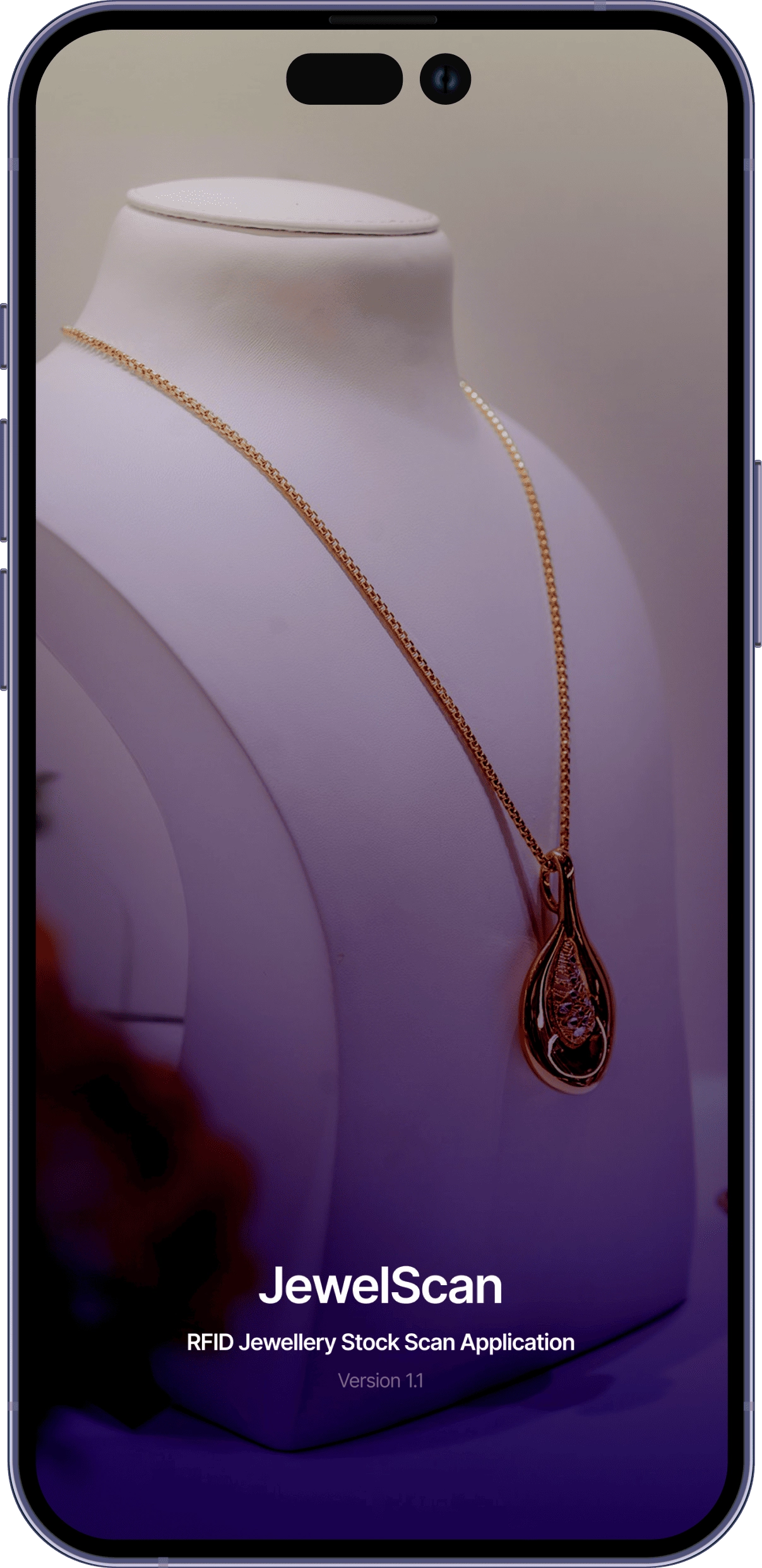
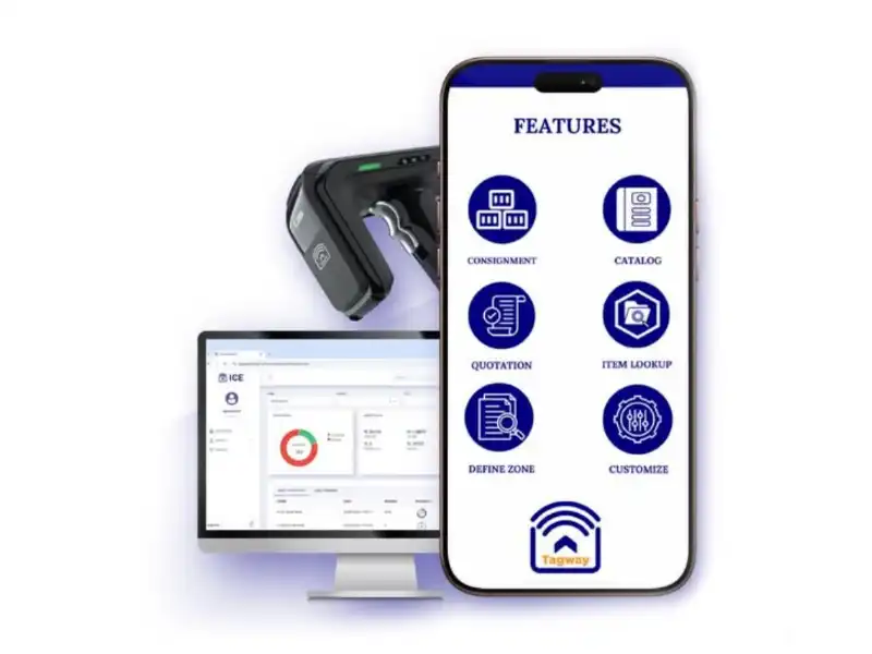
JewelScan is a mobile app designed for Indian jewellery retailers to scan RFID-tagged products, manage inventory across store locations, and assist customers during product selection.
The app supports both operational tasks such as stock audits and sales activities like product comparison.
Jewellery stores manage thousands of high-value items stored across multiple locations such as floors, rooms, lockers, and trays. Traditional stock audits are slow, disruptive to showroom operations, and prone to human error.
Designing an RFID scanning system was not just about speed. Staff also needed a clear understanding of where products were located during and after a scan.
This project operated under significant real-world constraints that shaped how I approached the design.
A 1-week delivery window with no budget for primary user research meant design decisions needed to be client-informed and domain-driven rather than research-validated.
Without the ability to conduct field studies or usability testing with actual store staff, I relied on client interviews, secondary research, and industry reports to inform design decisions.
The same app serves two distinct use cases: operational (stock audits by staff) and customer-facing (product comparison during sales). This required clear contextual separation without fragmenting the experience.
I started the project with a stakeholder discussion to understand the business, workflows, and expectations. The client runs a software company focused on building solutions for jewellery retailers, which provided strong domain context despite the limited project timeline.
Since direct user research was not possible within one week, most insights came from these discussions and the client’s experience working closely with jewellery stores.
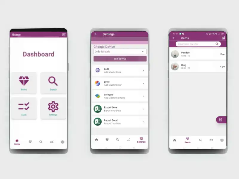
The visual system focuses on clarity and usability, helping staff quickly understand information during fast-paced store operations.
Clean and highly readable on mobile screens, making it easy to scan dense information.
Body text example
Caption text
Semantic colors for success, warning, and error states.
Feather icons were used for their clean and minimal style, making actions easy to recognize.

4 Column Layout
16px margin, 8px gutter
Provides consistent spacing and alignment across mobile screens.
Design Approach
I structured the design process around "How Might We" questions. This helped me stay focused on solving specific problems rather than getting lost in feature lists.
The timeline was tight, so I focused energy on the moments that carried the most risk. Working closely with the client, I mapped the scan flow against real store scenarios from their previous implementations. Three tensions shaped most of the decisions: making location selection intuitive without oversimplifying the store hierarchy, handling interruptions gracefully, and surfacing missing items in a way that felt actionable rather than alarming.
User navigates the store hierarchy to define the scan scope before beginning.
RFID tags are read in real time with live progress tracking and persistent location context.
Scan is paused and state is saved. User resumes from the exact point of interruption.
Scan summary is generated. Missing items are surfaced, filtered, and exported for action.
Working within a tight timeline, I prioritised getting ideas into high-fidelity quickly rather than spending time on low-fidelity sketches. Since the home screen is the first thing users interact with, I wanted to test 2-3 different directions early and make a confident decision before building out the rest of the app.
Introduced scan summaries and quick actions
Early exploration focusing on scan entry points
Final layout prioritising audit flow and clarity
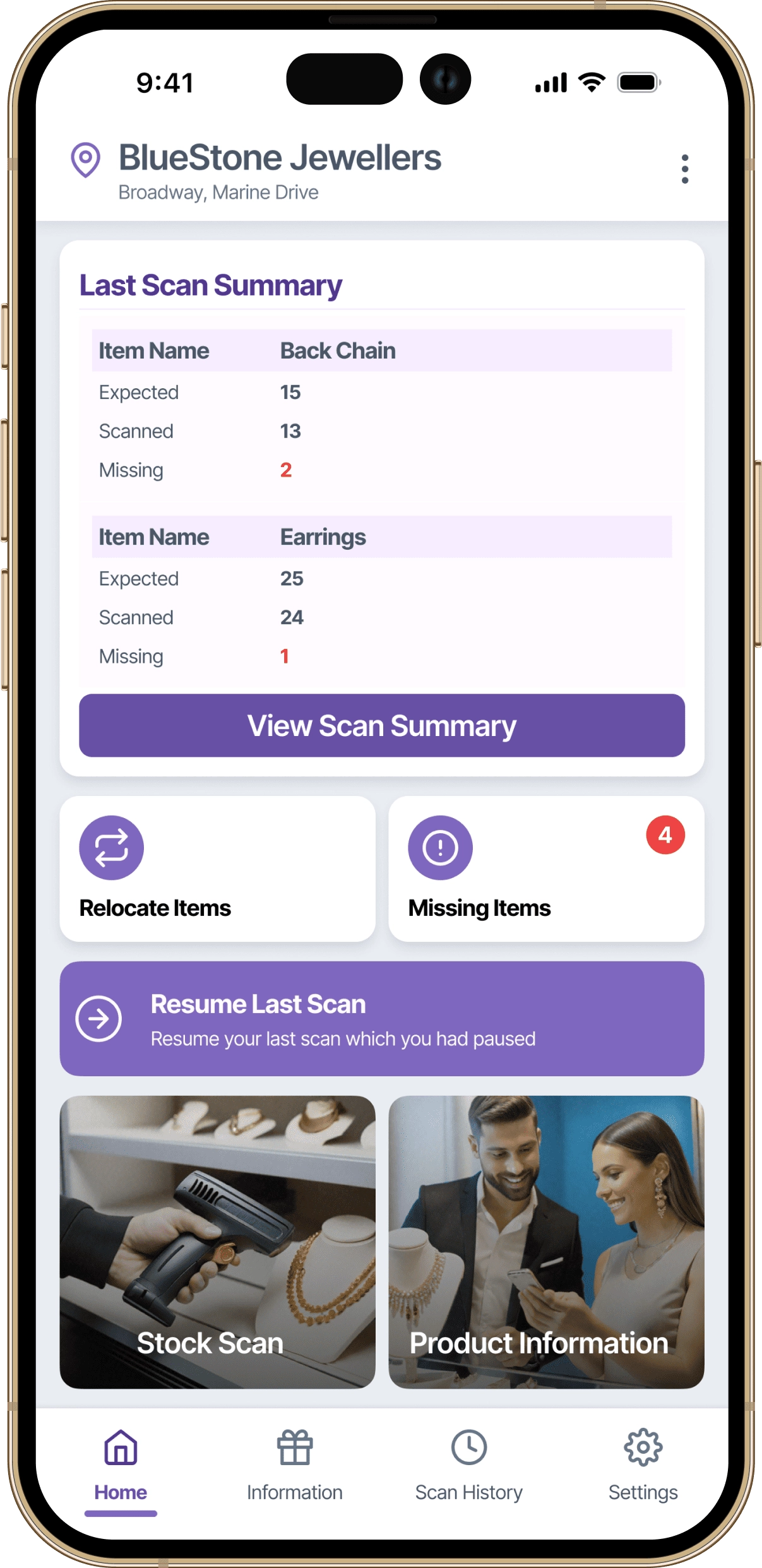
This flow illustrates how jewellery store staff initiate, manage, and complete RFID-based stock audits during daily operations.
The experience is designed to minimise cognitive load during live scanning, support interruptions through pause and resume states, and provide a clear, actionable summary at the end of each scan.
Scan results can be reviewed on the device and shared with managers or owners, ensuring transparency and faster decision-making without relying on manual reports.
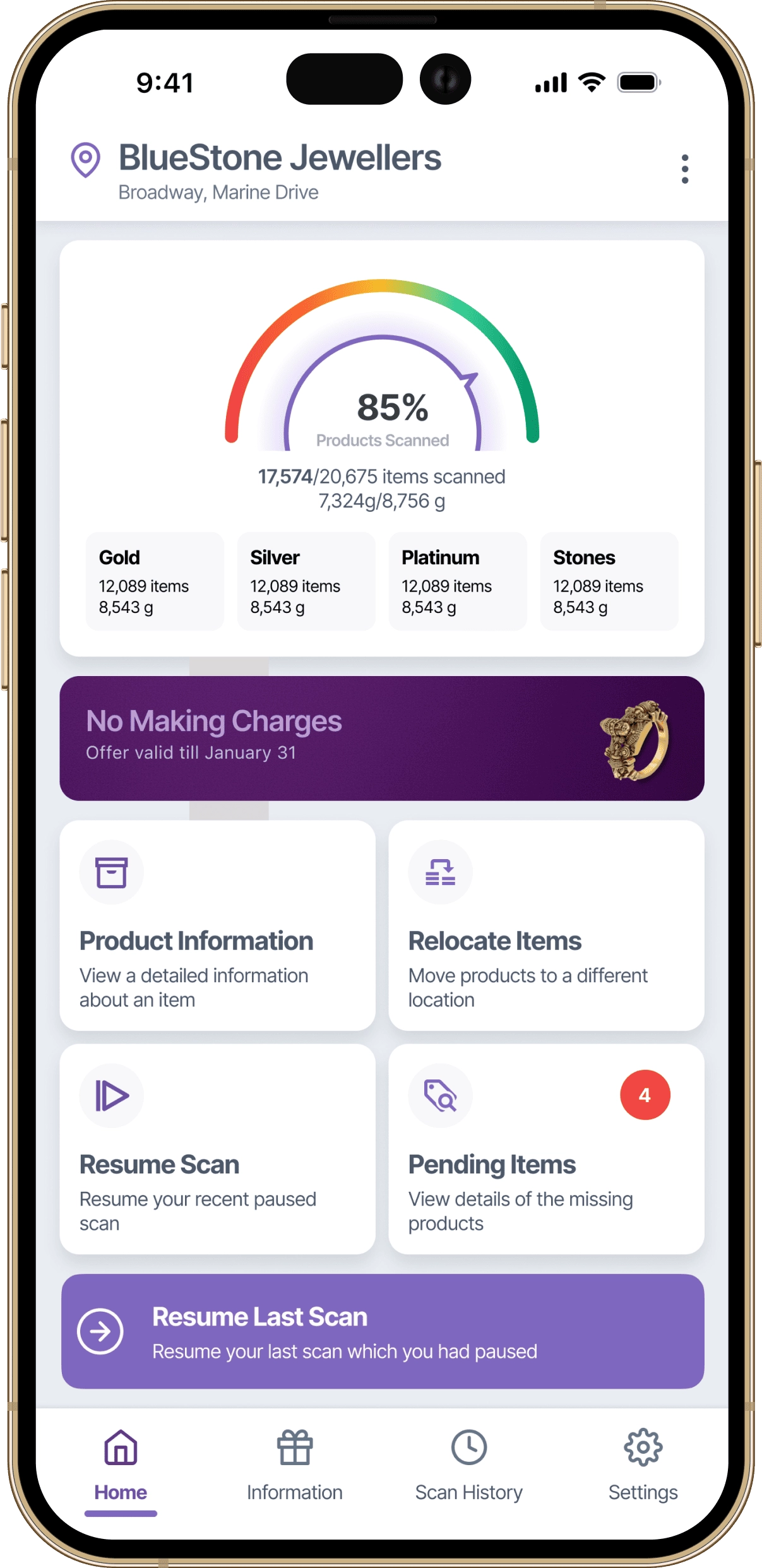
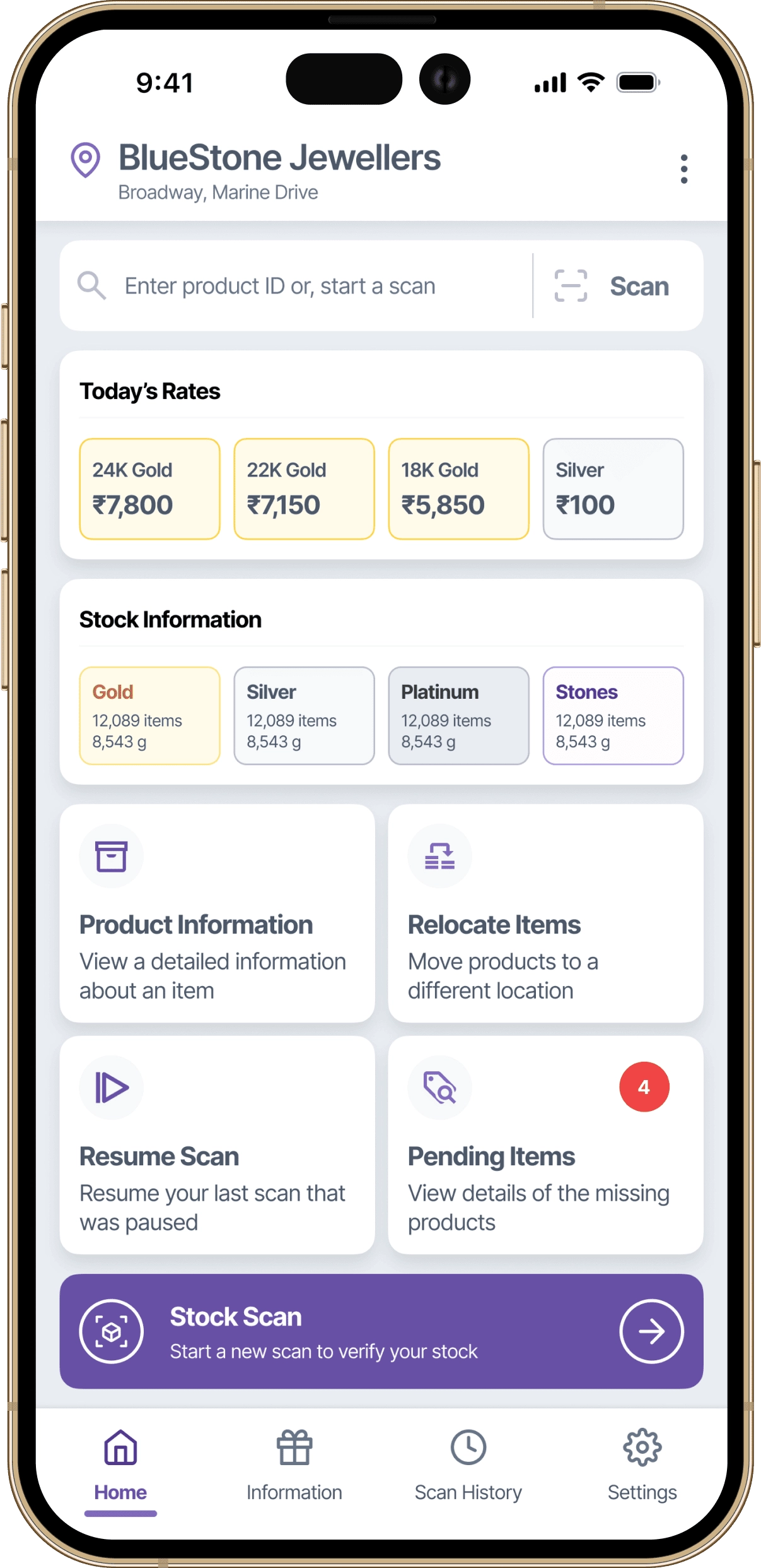
Designed around what staff actually come to do. The most frequent actions are the most visible ones.
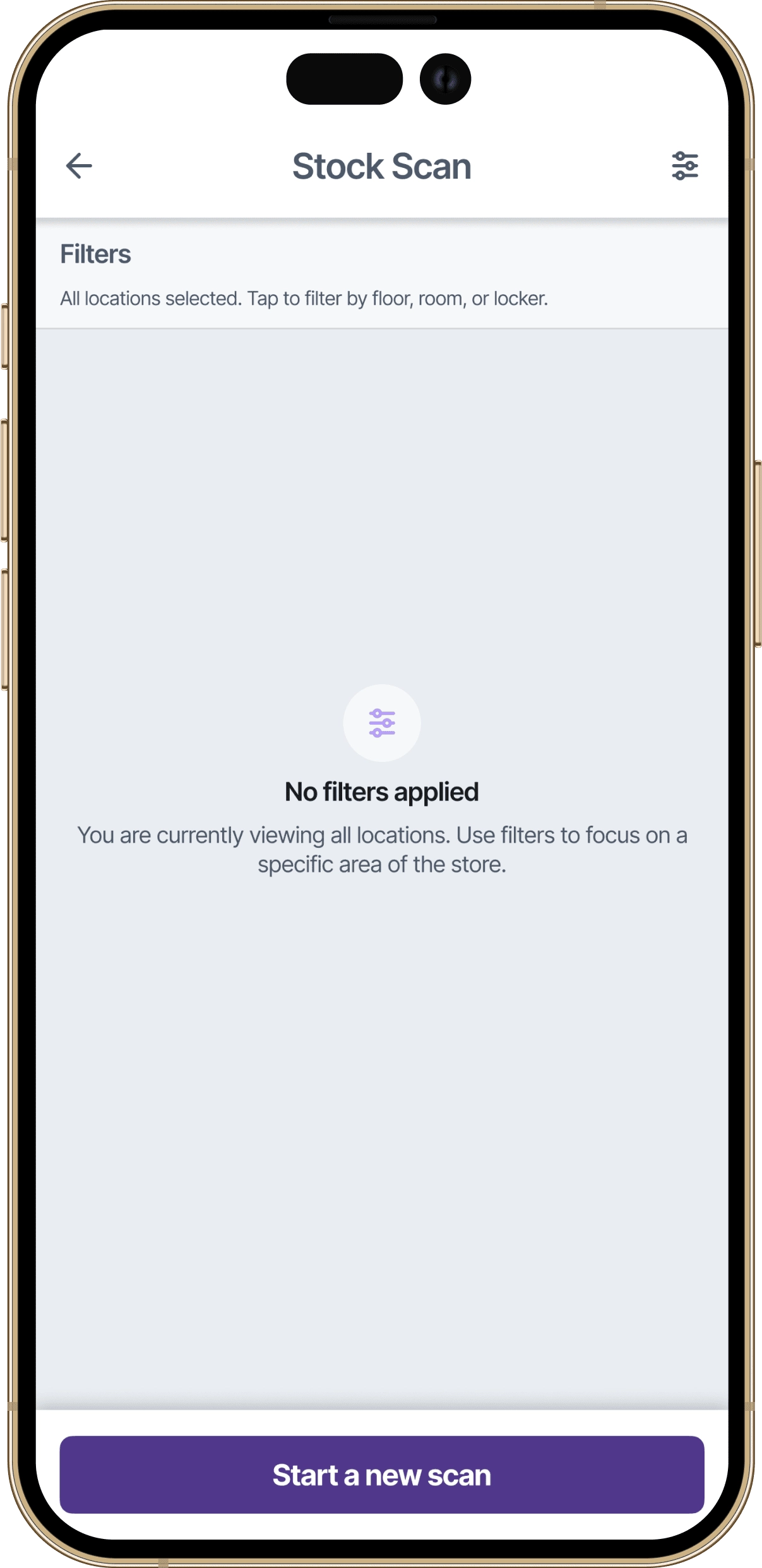
Staff define what they are scanning before they begin. Filters are available at the top for quick access to specific locations within the store hierarchy.
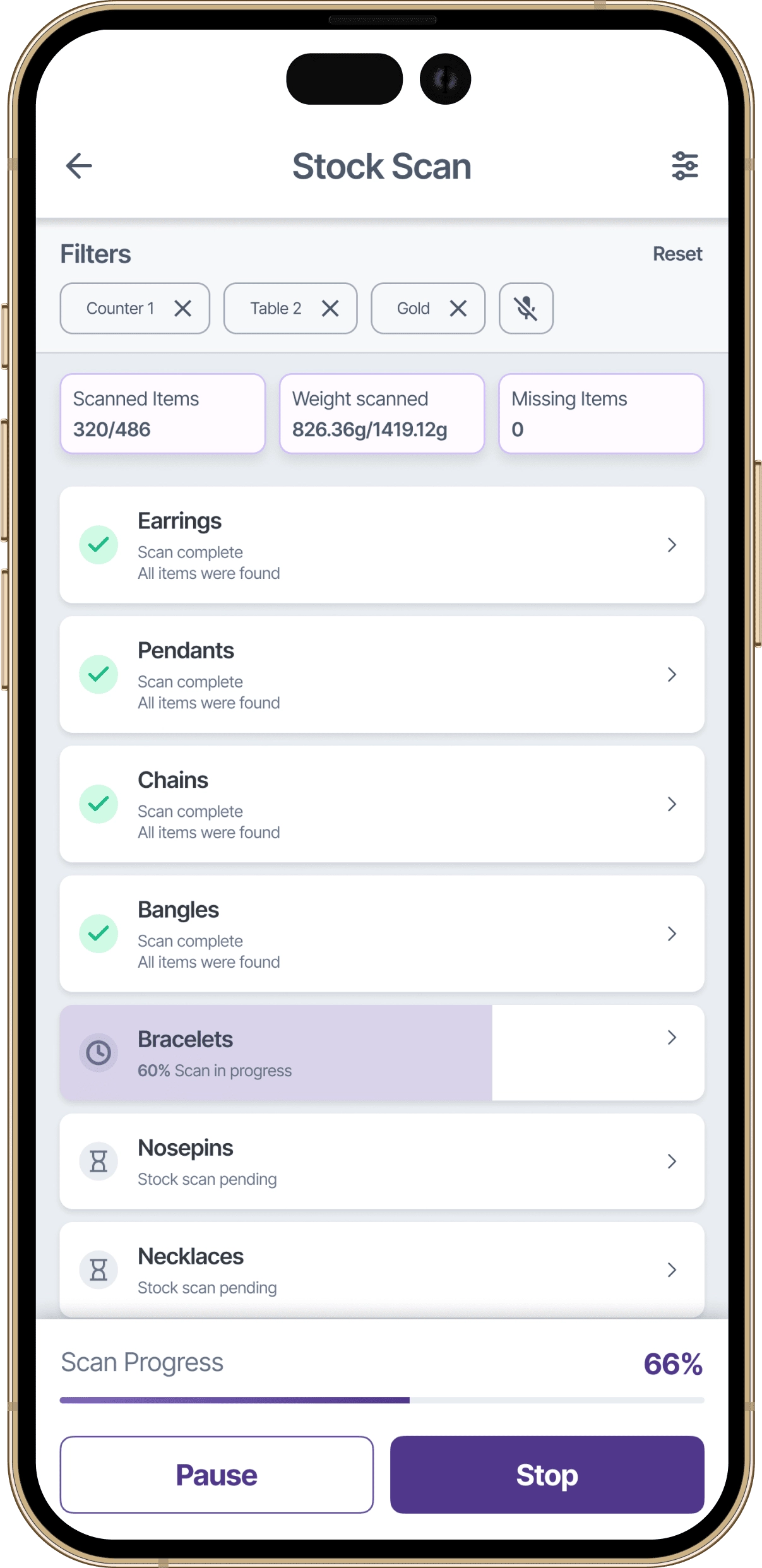
Items are being detected in real time. Your progress saves automatically, so you can pause anytime without losing your place.
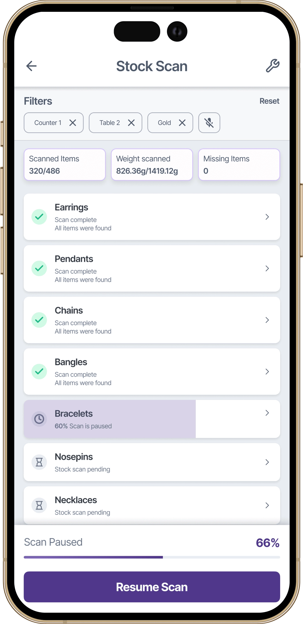
The app saves scan state automatically. Whether it's a customer walk-in or a phone call, pausing a scan costs nothing.
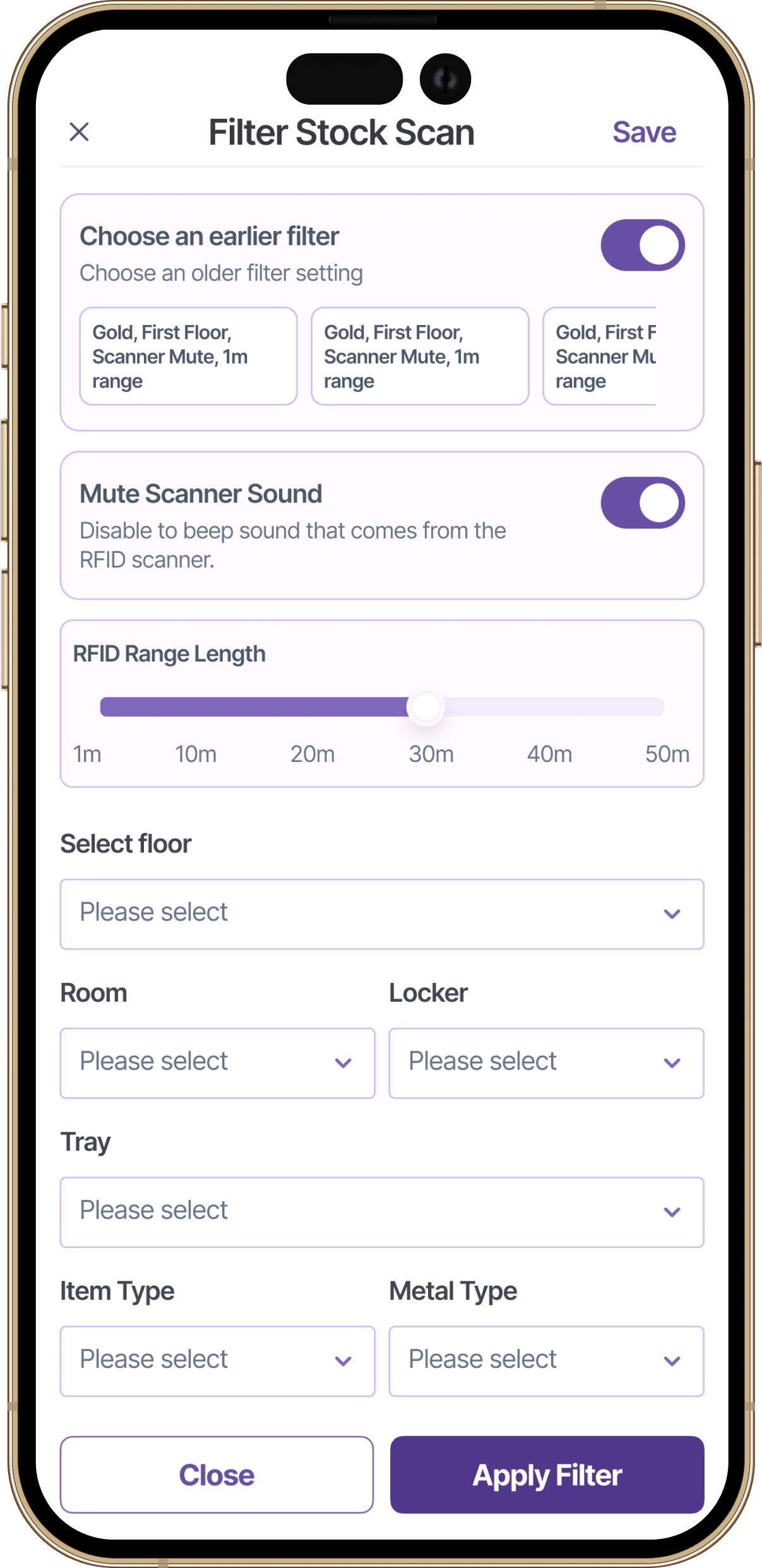
Not every audit covers the entire store. Filters give staff the flexibility to look at exactly the area they need.
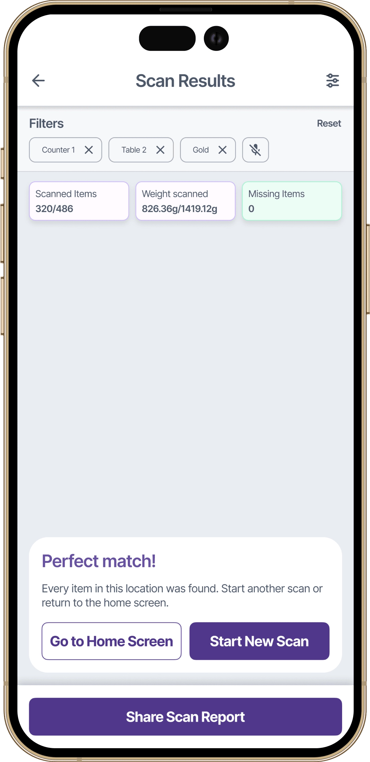
All items matched the expected inventory. This location is fully accounted for.
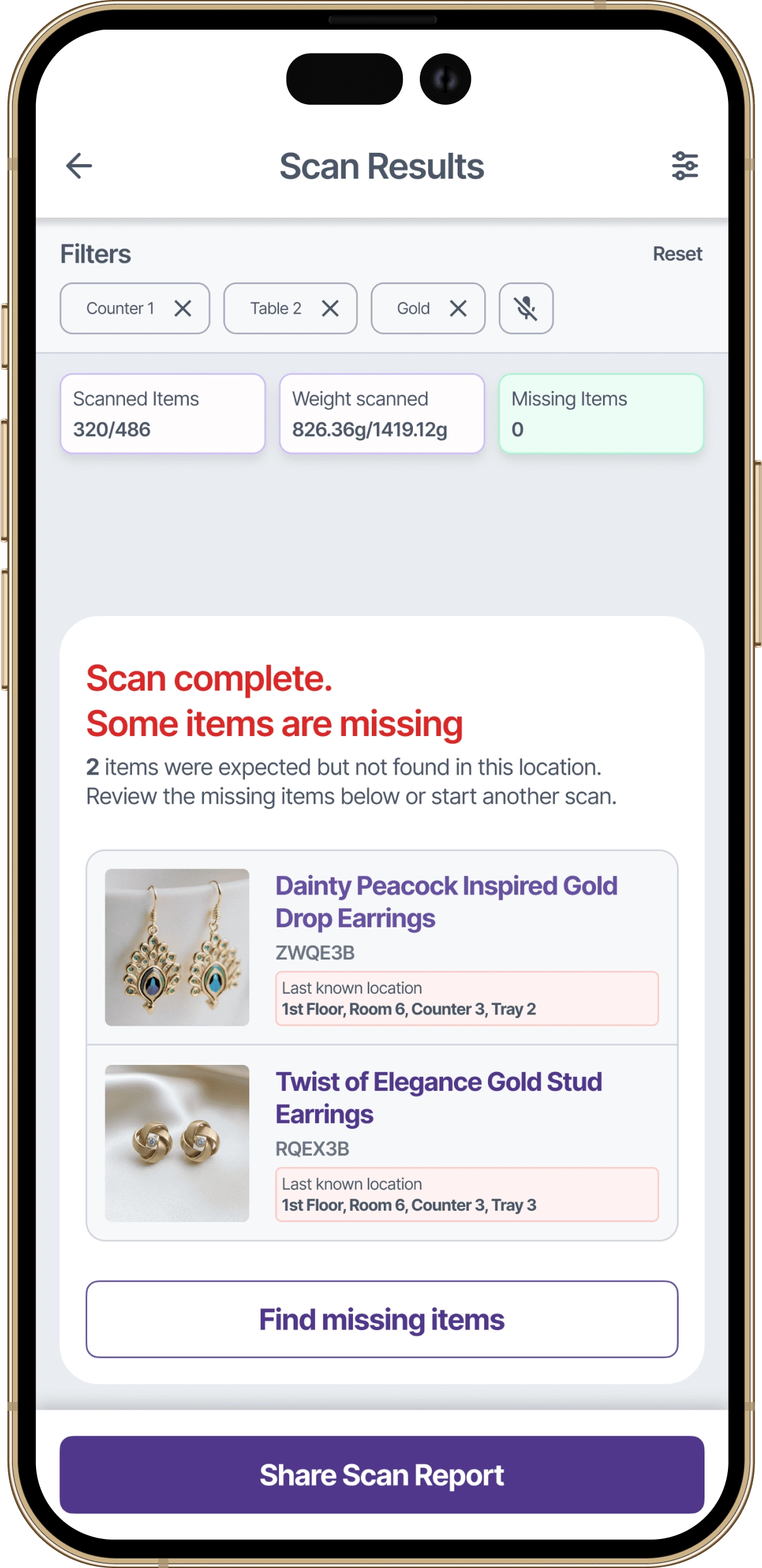
These items were expected in this location but did not appear in the scan.
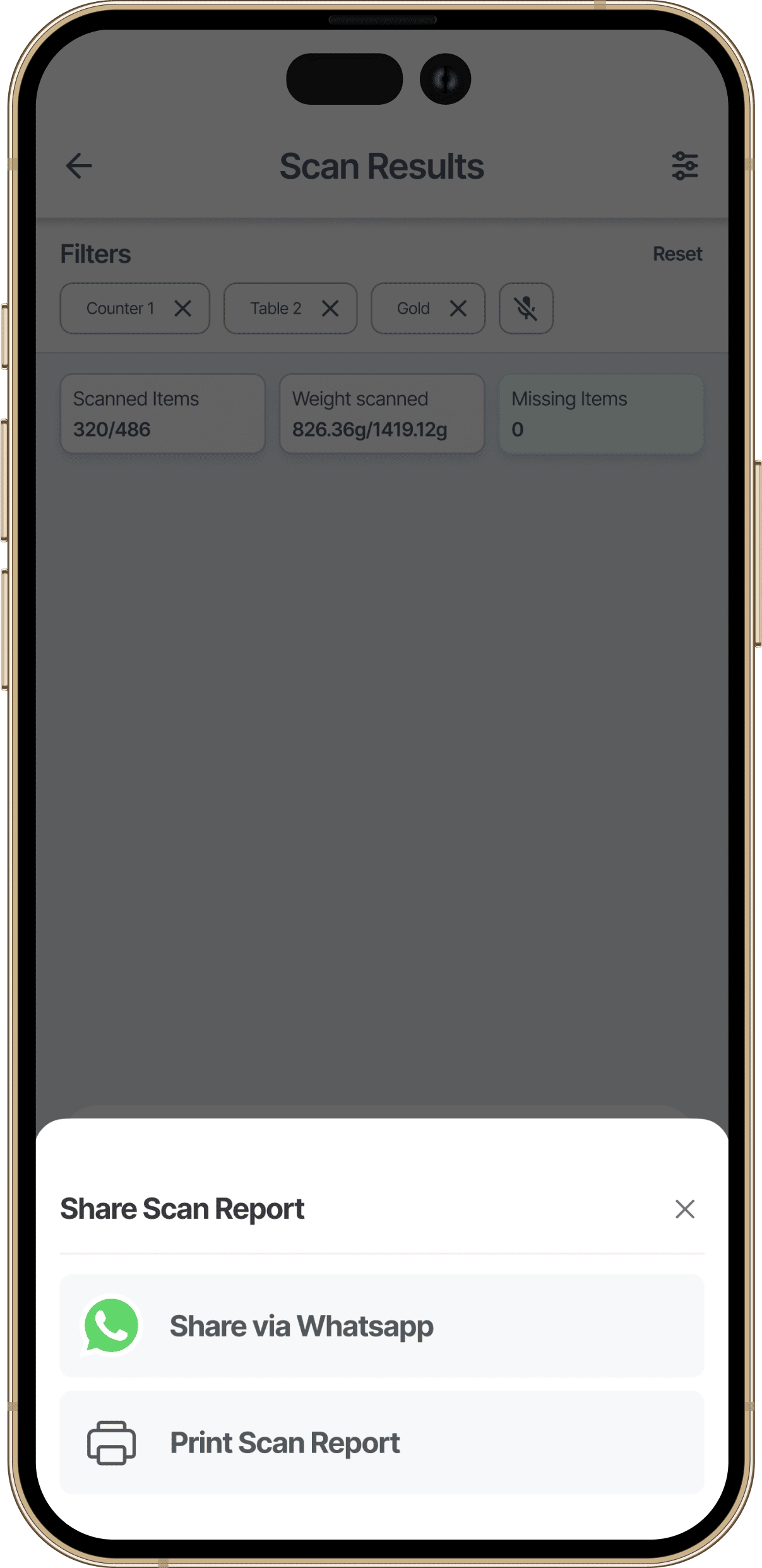
Scan results can be shared directly with store owners or managers. No screenshots, no manual reporting, just a clean summary sent straight to the people who need it.
Moving high-value jewellery requires precision. I designed the relocation flow with a two-step confirmation: select the new location using the familiar hierarchy (floor, room, locker, tray), then review a summary showing both old and new locations before committing. The extra step prevents costly mistakes.
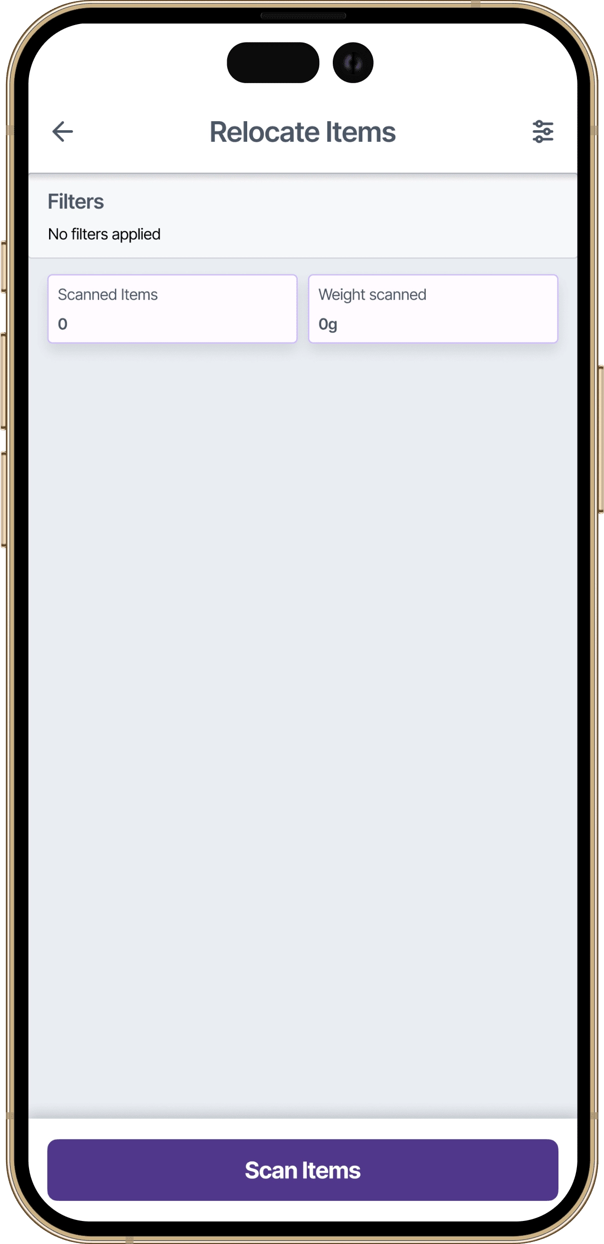
Before moving items, staff scan them to confirm which pieces are being relocated. This ensures accuracy before any location changes are committed.
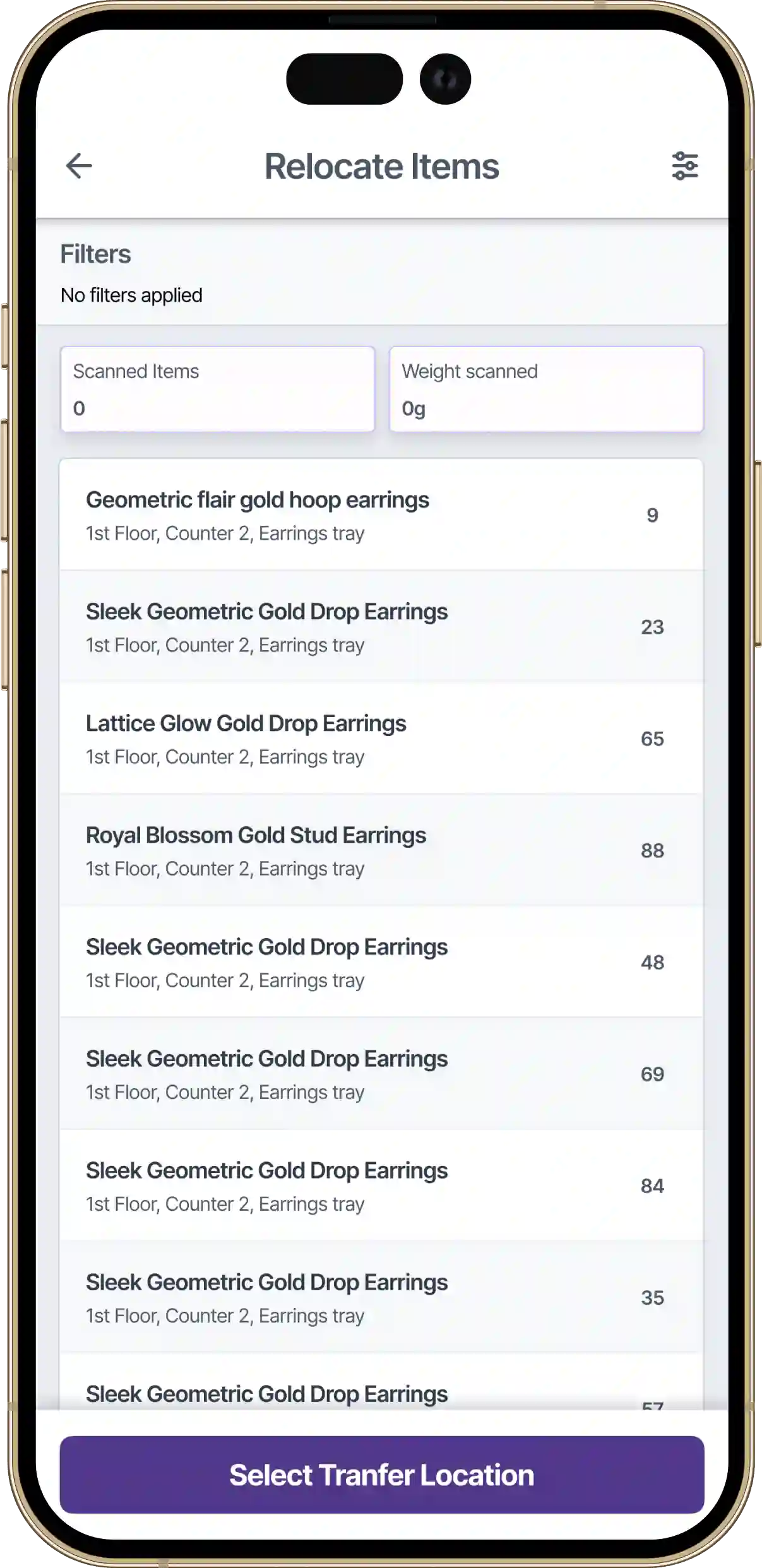
All items have been scanned and confirmed. Staff can now proceed to select the new location where these pieces will be stored.
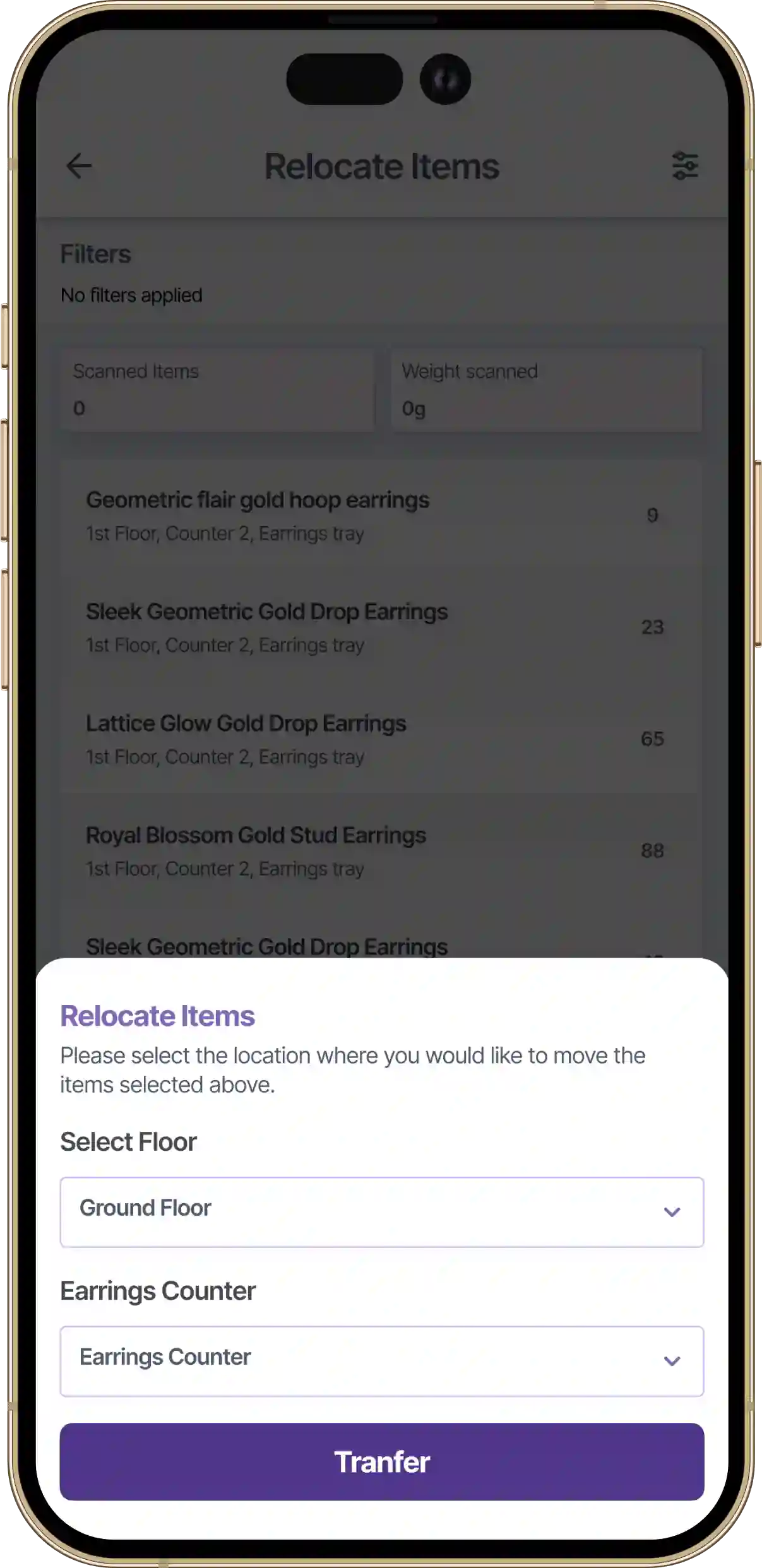
A bottom sheet guides staff through the familiar location hierarchy: floor, room, locker, tray. Items will be moved to the selected destination.
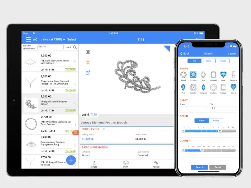
Supporting customer conversations meant designing for a completely different context. When a sales person is standing with a customer, they need quick access to product specifications and an easy way to compare similar items side by side. I created two connected experiences:
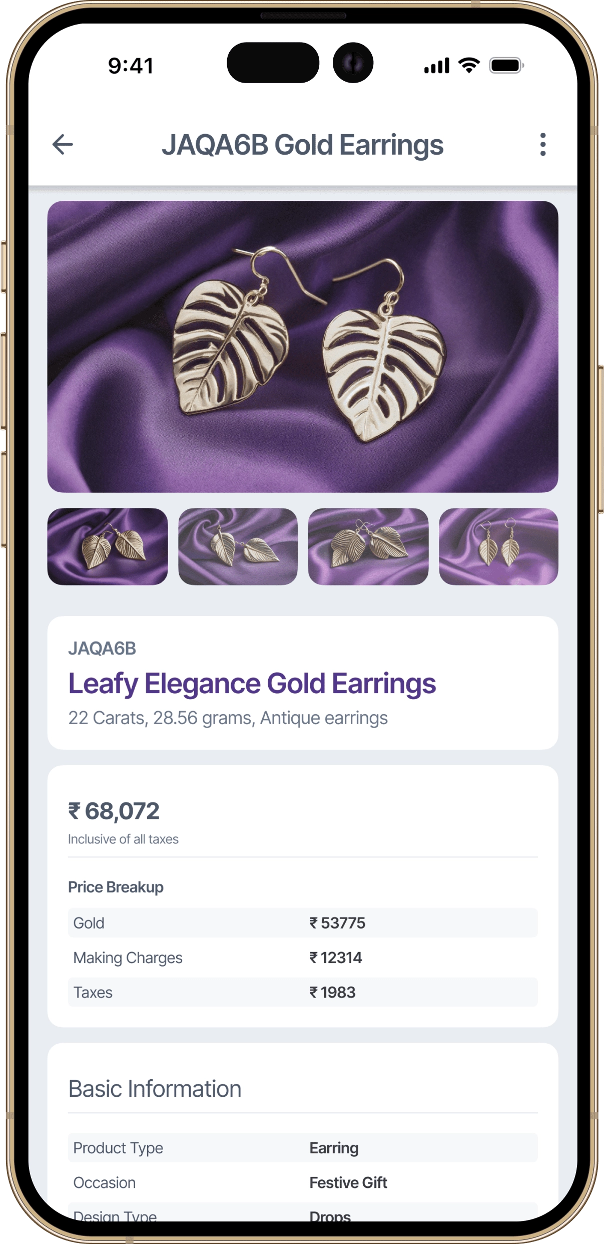
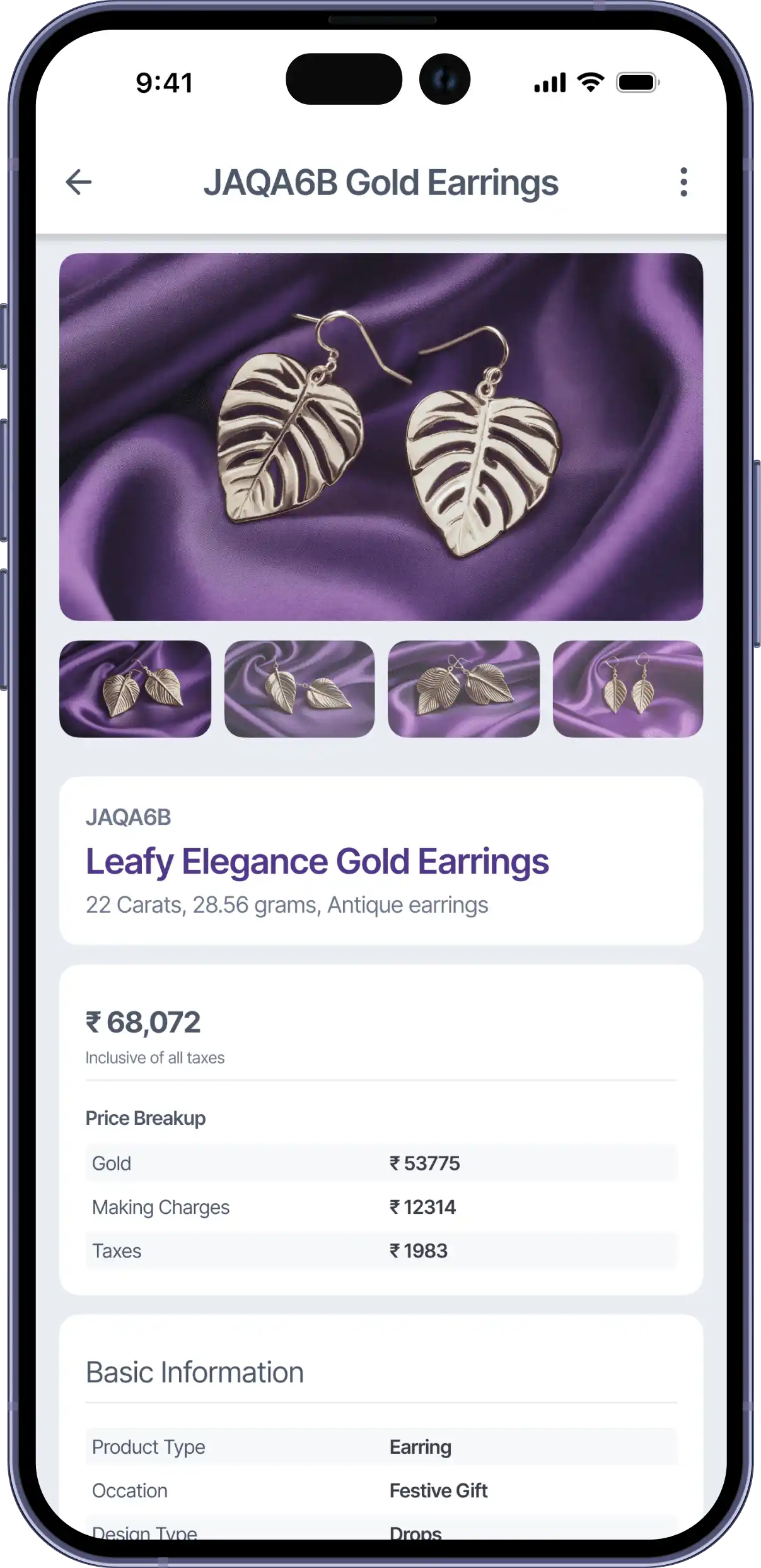
This screen provides quick access to essential jewellery details such as product type, weight, purity, and current location within the store. It is designed to support both inventory audits and in-store customer conversations without overwhelming the user with system data.
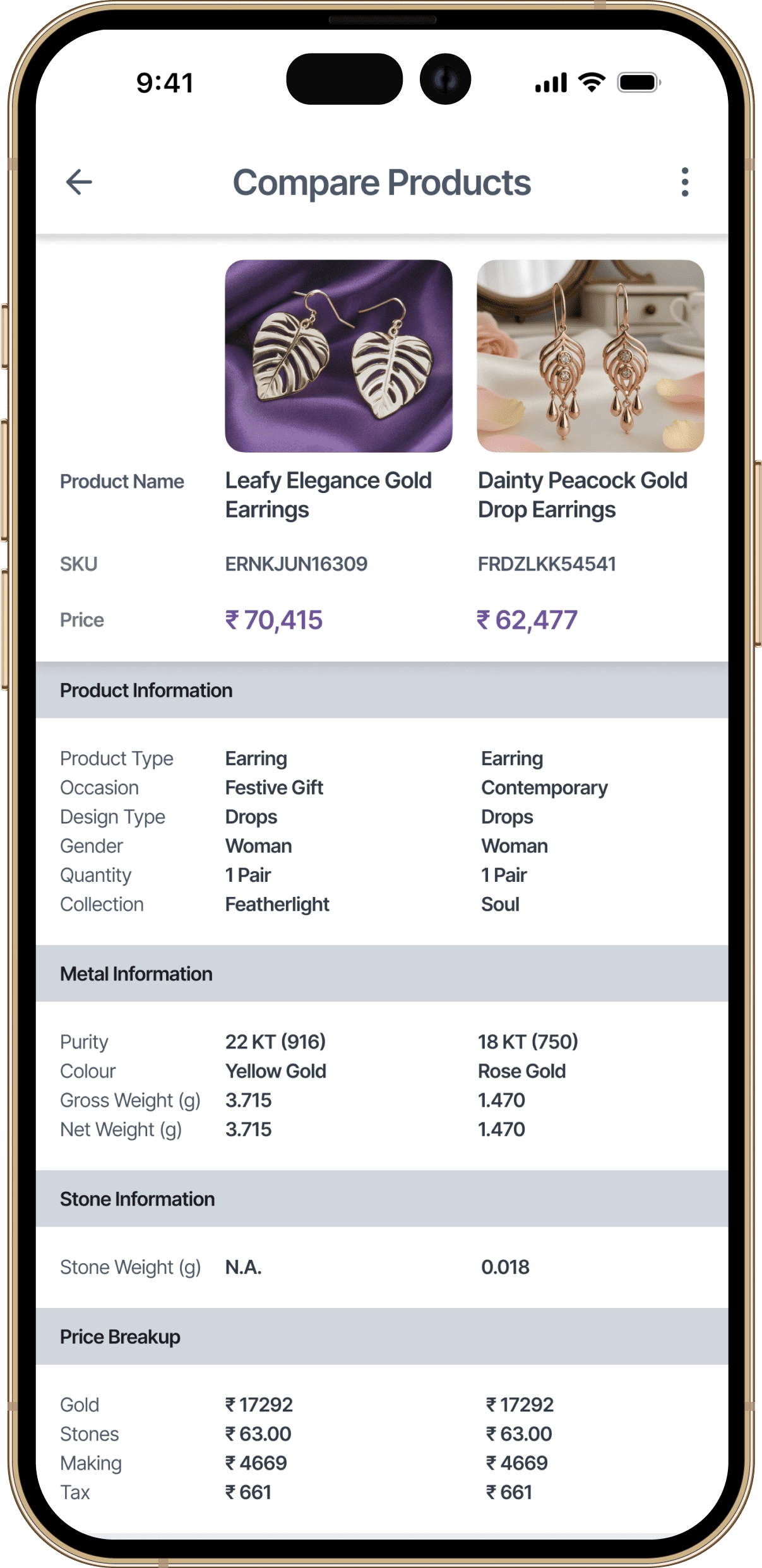
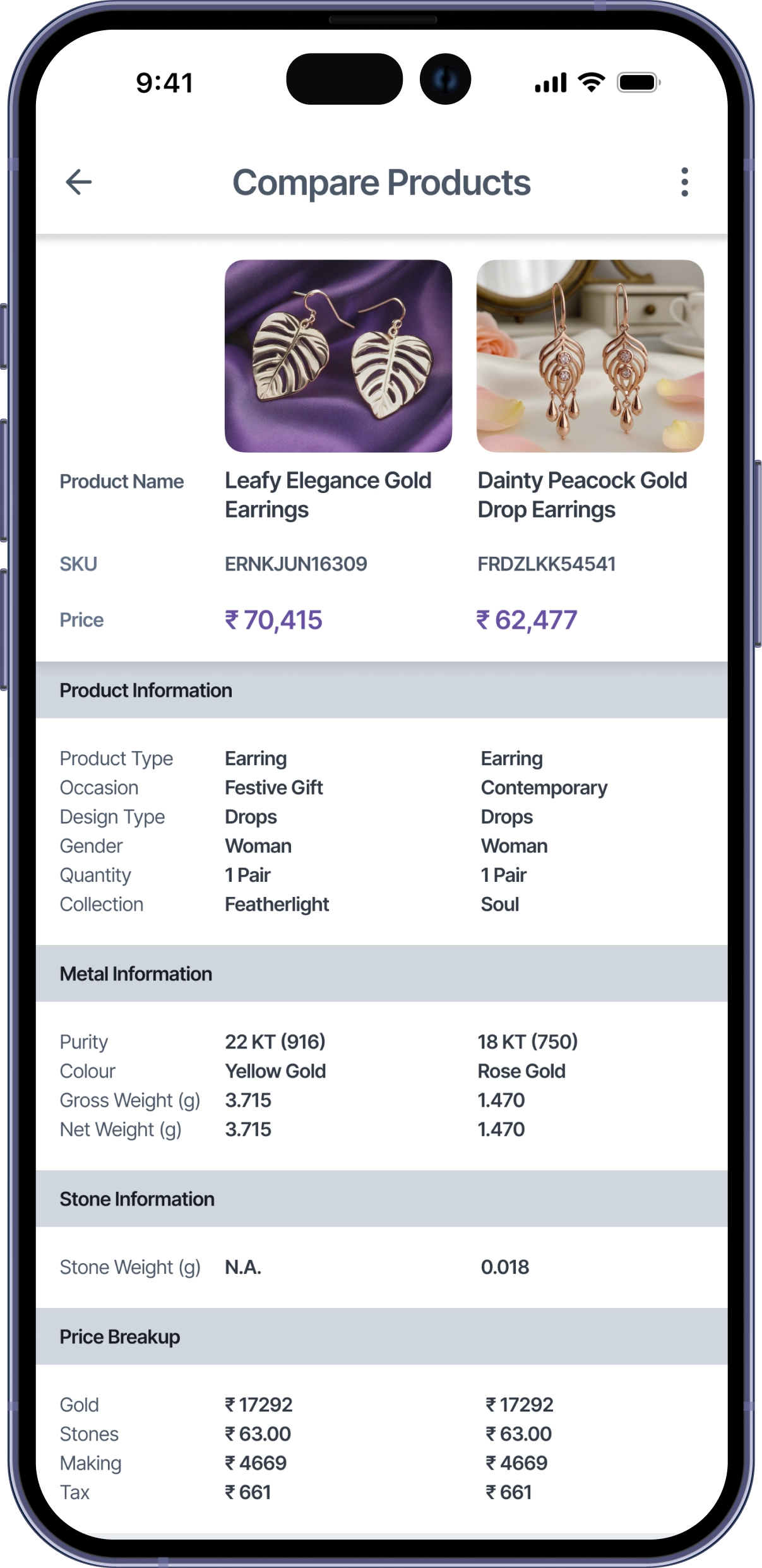
The comparison screen allows staff to place two jewellery items next to each other and review key attributes in parallel. By limiting the comparison to two products, the design keeps conversations focused and helps customers make confident decisions during sales interactions.
Impact
While post-launch metrics weren't formally tracked, the client's experience implementing similar systems across jewellery retailers provided context for expected operational improvements.
Based on the client's observations, stores using systems without pause/resume capabilities saw approximately 30-40% of audits abandoned mid-process due to interruptions. The persistent scan state was designed to eliminate this abandonment entirely by allowing staff to resume exactly where they left off.
The client reported that previous inventory solutions required 3-4 hours of training before staff could independently conduct basic scans. The intent-based navigation and consistent location patterns were designed to reduce this to under 20 minutes for core operations.
Two-step confirmation for product relocation was introduced after the client identified that roughly 1 in 10 relocations in previous systems resulted in items being moved to incorrect locations, requiring manual reconciliation.
Sales staff previously spent an average of 15-20 minutes per customer locating and comparing similar products manually. The dedicated comparison feature was designed to reduce this to under 5 minutes by surfacing key differences immediately.
Contact
If you’re looking for a product designer who values clarity, collaboration, and long-term thinking, feel free to reach out. Share a bit about what you’re building and I’ll take it from there.